What is data visualization: Quick Guide to Clear Insights
What is data visualization? Learn what is data visualization, its definition, key concepts, and practical tools to turn complex data into actionable insights.
So, what is data visualization? At its core, it's the art of turning boring numbers into a picture your brain actually wants to look at. It translates raw data into charts, graphs, and maps that reveal insights in seconds, making complex information clear, engaging, and easy to understand. Think of it as giving your spreadsheets a much-needed personality transplant.
Untangling Your Data Overload
Let's be real—the term 'data visualization' sounds like something invented in a boardroom to make spreadsheets sound exciting. But it’s a surprisingly simple and powerful idea. Imagine trying to understand your company's sales performance by reading a 50-page report filled with endless rows of numbers. It’s a chore, right? Your eyes glaze over, and you probably miss the critical details.
Now, picture that same information as a single, clean line chart.

Instantly, you see the epic sales spike last quarter, the slight dip in July, and the steady recovery since. One is a headache; the other is a genuine 'aha!' moment. That's the magic of data visualization in action.
More Than Just Pretty Pictures
It’s crucial to understand that this isn’t just about making data look nice for a presentation. Effective visualization is about storytelling and discovery. It's the bridge between raw, unprocessed information and actionable business intelligence. The human brain processes visual information 60,000 times faster than text, which is why a good chart can communicate a trend far quicker than a paragraph ever could.
This process involves several key steps:
- Gathering Data: Collecting the raw numbers and figures from various sources.
- Processing Data: Cleaning and structuring the information so it’s ready for analysis.
- Designing the Visual: Choosing the right chart or graph to represent the data accurately.
- Telling the Story: Presenting the visual in a way that highlights key insights and answers important questions.
This is where many businesses get stuck, juggling different tools for each step. A platform like brings this entire workflow under one roof, allowing you to move from raw data to a clear, insightful dashboard without the usual friction. It removes the technical hurdles so you can focus on what the data is actually telling you. To truly grasp the impact of making data visible and understandable, explore a deeper dive into .
Think of it like swapping a dense, text-only recipe book for a series of clear, illustrated cooking steps. Both contain the same information, but one guides you to a successful outcome much more efficiently. Data visualization does the same for your business decisions.
A Quick Trip Through Visualization History
Long before fancy software could whip up a pie chart faster than you can brew coffee, people were already finding ways to visualize data. This isn't some new trend born in a startup garage; it's a practice rooted in our timeless need to see patterns and make sense of the world around us. A little history lesson isn't just for trivia—it shows us that the drive to find meaning in numbers is fundamentally human.

This journey began thousands of years ago, far before computers were even a whisper of an idea. Think about it: early cave paintings tracked animal migrations, and Mesopotamian clay tokens were used for inventory management around 5500 B.C. These weren't just artifacts; they were the world's first databases. This line of thinking continued through tools like the Incan quipus, which used intricate knots on strings to encode complex information. If you're curious, you can explore the fascinating milestones of data viz history to see just how deep these roots go.
The Golden Age of Graphics
The 19th century is widely considered the "Golden Age" of statistical graphics, a period that set the stage for almost every tool we rely on today. This era was defined by groundbreaking work that showed how a single, well-crafted visual could genuinely change the world.
Two prime examples immediately come to mind:
- John Snow's Cholera Map (1854): When a terrifying cholera outbreak gripped London, Dr. John Snow went beyond the raw statistics. He mapped every single case, and in doing so, he revealed a chilling cluster around one specific water pump. His simple dot map was the proof needed to show the disease was waterborne, not airborne—a discovery that helped stop the epidemic in its tracks.
- Charles Minard's Napoleon Map (1869): Often hailed as one of the greatest charts ever made, this visual tells the tragic story of Napoleon's catastrophic Russian campaign. It brilliantly weaves together six different data points—the army's size, location, direction of travel, temperature, and time—into one devastating narrative of loss.
These historical masterpieces prove a critical point: the goal of data visualization has always been to reveal truth and drive action. A great visual isn't just about presentation; it's about discovery.
This rich history shows that turning raw data into compelling visual stories is one of our most fundamental communication tools. It’s the very foundation that modern platforms are built on. Today, tools like the integrated workspace at are the next step in this evolution, making the timeless quest for clarity a powerful and accessible reality for everyone.
Why Your Business Needs Data Visualization
Sure, a slick chart looks great in a presentation, but what’s the real business value of data visualization? It’s not about making numbers look pretty. It's about finding the stories hidden inside your data—stories that directly impact your bottom line.
Without visuals, you’re flying blind. You're left trying to make critical decisions based on gut feelings or by wading through spreadsheets that stretch on for miles. Visualizing data transforms those abstract figures into something your entire team can grasp and act on instantly. This isn't just a nice-to-have; it's a powerful engine for growth, efficiency, and staying one step ahead of the competition.
Spot Trends and Seize Opportunities
Raw data in a table shows you numbers, but a visual chart tells you a story. A simple line graph can immediately spotlight a rising sales trend, giving you the chance to double down on what’s working before anyone else catches on. It all comes down to speed and clarity.
Think about a heat map showing your sales territories. All of a sudden, you see an untapped market glowing bright red with potential, or you notice a region that’s unexpectedly falling behind. These insights, completely buried in rows of data, pop right out in a visual format. This empowers you to make smarter, proactive decisions and shift from reacting to the market to actually leading it.
Data visualization is the fastest way to find the signal in the noise. It helps you uncover costly problems hiding in plain sight and communicate complex findings to stakeholders who don't have time to read a novel-length report.
Drive Smarter Decision-Making Across Your Team
One of the biggest wins with data visualization is that it makes data accessible to everyone. When information is presented visually through interactive dashboards, it’s no longer just for data analysts. Your marketing manager can see which campaigns are pulling in leads, and your operations lead can pinpoint supply chain bottlenecks, all without writing a single line of code.
This fosters a culture of data literacy where every person on the team is empowered. For example:
- Sales teams can use funnel charts to see exactly where prospects are dropping off in the sales cycle and then tweak their strategy on the fly.
- Product managers can analyze user behavior with scatter plots to identify which features are a hit and which ones need a rethink.
- Marketers can track campaign ROI with clear bar charts, helping them justify their budget and optimize future spending for maximum impact.
When everyone is speaking the same visual language, collaboration just clicks. Decisions are backed by hard evidence, not guesswork. This unified approach to is fundamental for scalable growth. A platform like is built for this very purpose, offering a single workspace where teams can move from raw data to shared, interactive dashboards without any friction. It turns data from a barrier into your greatest asset.
Common Types Of Data Visualizations
Ever tried to make sense of a spreadsheet with thousands of rows? It's like trying to find a single story in a phone book. Choosing the right way to visualize that data is what turns a wall of numbers into a clear, compelling narrative.
Think of it like this: you wouldn't use a hammer to saw a board in half. Each visualization type is a specific tool designed for a specific job. Picking the right one is the first and most critical step in making your data understood. For a deeper dive into the principles behind these choices, check out our complete guide to .
The infographic below offers a great starting point, showing how your business goal should guide your choice of visualization.
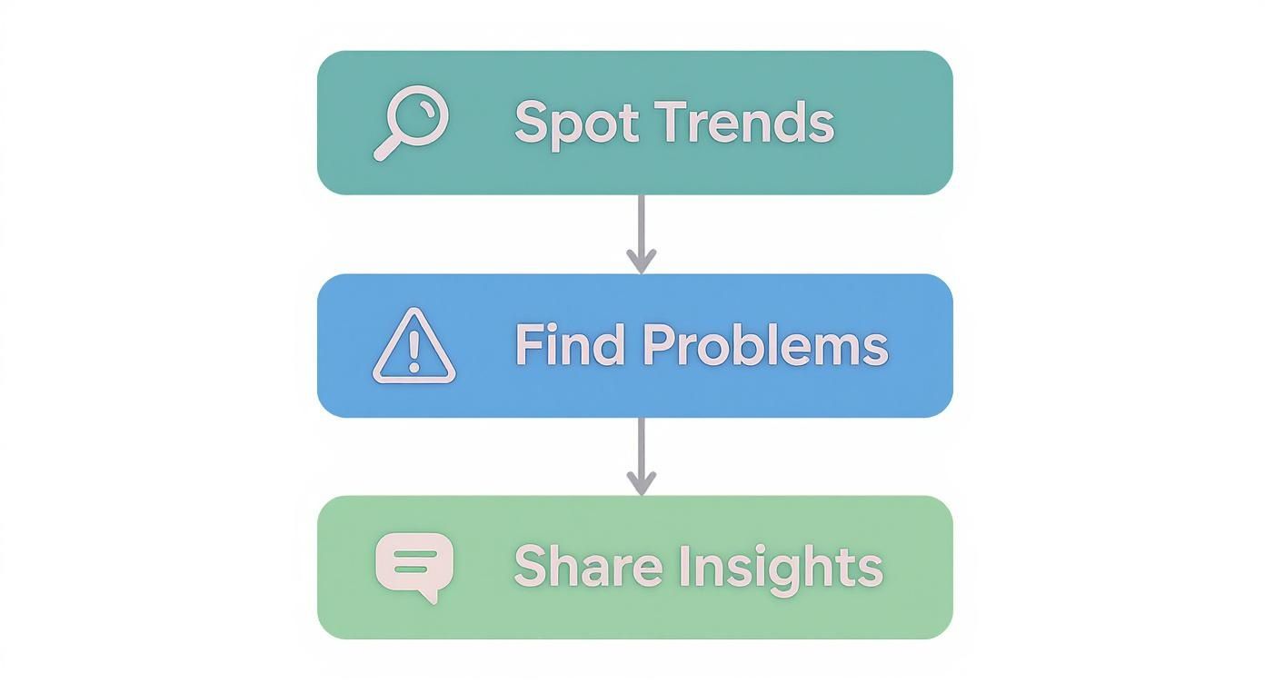
As you can see, whether you're spotting a trend, flagging a problem, or sharing a success, there's a visual approach tailored to that exact purpose.
The Foundational Four Charts
Let's start with the absolute essentials. These four chart types are the workhorses of the data world. Once you get these down, you'll be able to handle about 80% of your day-to-day visualization needs.
- Bar Charts: These are your go-to for comparing different categories. Want to see which product line generated the most revenue or compare marketing campaign performance? A bar chart makes the comparison immediate and obvious. Their strength lies in their simplicity.
- Line Charts: Nothing beats a line chart for tracking a metric over time. They're perfect for showing monthly sales figures, website traffic trends, or stock price fluctuations. The upward and downward slopes instantly tell a story of growth or decline.
- Pie Charts: Use these sparingly and with a clear purpose. A pie chart is only effective for showing parts of a whole when you have just a few slices (think six or less). They work well for things like market share breakdowns or simple survey responses. Seriously, if your pie chart looks like a Trivial Pursuit wheel, you’ve gone too far.
- Scatter Plots: When you need to see if two things are related, reach for a scatter plot. It's the best way to spot a potential correlation between two different variables—for example, seeing if there's a link between your ad spend and the number of new leads.
Choosing The Right Chart For Your Data
To make the selection process easier, here's a quick reference guide to help you select the most effective chart type based on your objective.
This table is a great starting point, but always remember to let your specific data and the story you want to tell be your ultimate guide.
Beyond The Basics
Once you've mastered the fundamentals, you can start exploring more advanced visuals to uncover deeper insights.
For instance, heat maps are brilliant for showing concentration, whether you're analyzing where users click on a webpage or identifying hotspots for sales activity on a map. Treemaps are another powerful option for visualizing hierarchical data, like breaking down a company's revenue by division, then by product, all in one compact view.
If you're in a specialized field, the visuals can get even more specific. There's a whole world of advanced designed to make complex market data understandable at a glance.
Ultimately, the goal isn't to use the fanciest chart but the most effective one. This is where a platform like Zemith can make a real difference. With its intuitive tools, you can easily experiment with different chart types, letting you see for yourself which visual tells the story of your data most powerfully.
The Evolution of Modern Visualization Tools
The journey from hand-drawn graphs to the AI-powered dashboards we use today has been a long and fascinating one. The tools of the trade have come a very long way, moving from niche academic circles to the desk of nearly every professional. Understanding this evolution helps explain why many businesses still struggle with a patchwork of complicated, disconnected systems.
It all started with the arrival of personal computers, which put the power of basic data analysis into everyone’s hands. Suddenly, you didn’t need to be a statistician to create a chart. This shift brought data visualization out of the shadows and into the mainstream, creating new possibilities for businesses everywhere.
The Dawn of Desktop Data
The real game-changer was the introduction of spreadsheet software. When debuted in 1985, it put a chart-making tool on virtually every office computer. For the first time, managers could quickly turn sales figures into bar graphs and financial projections into line charts. It was a massive leap forward, but it also came with its own set of problems.
Creating visuals in these early tools was often a clunky, manual process. Data was frequently siloed in separate files, leading to version control nightmares and endless copy-paste errors. While Excel democratized basic charting, it often created more headaches than it solved, leaving teams with static, outdated, and sometimes misleading graphs.
The Rise of Specialized Platforms
The next major shift came with the modern era of specialized Business Intelligence (BI) tools. The 21st century saw the launch of powerful platforms like and , designed specifically for interactive data exploration. This technological boom, which turned data visualization into an industry now worth over $7 billion, allowed analysts to connect directly to live data sources and build dynamic dashboards. If you're curious, you can explore the to see just how much computing transformed the field.
However, this newfound power came at a cost.
While these specialized tools offered incredible capabilities, they also introduced steep learning curves. Businesses often found themselves reliant on a small group of technical experts who could navigate the complexities of these platforms.
This created a bottleneck where the people with the business questions couldn't get answers without going through a data specialist. The result was a familiar struggle: juggling multiple expensive tools, wrestling with messy data preparation, and waiting in line for an expert to build a report. This context is exactly why a smarter, more integrated approach is needed. Platforms like Zemith are designed to solve these very problems, offering a unified workspace that eliminates the need for multiple tools and empowers everyone—not just the data gurus—to find answers.
Streamline Your Workflow With Zemith
Knowing what data visualization is and why it matters is a great start. But let's be honest, the how is where things often get messy. Most of us have been there—stuck juggling one tool for cleaning data, another for crunching the numbers, and a third just to build the charts. It’s a disconnected and frustrating process that eats up valuable time and practically invites errors.
There’s a much better way to work. Instead of wrestling with a patchwork of different software, a unified platform like is designed to eliminate that complexity. It gives you a single, cohesive workspace where your data can move smoothly from raw input to a polished, interactive dashboard.
From Frustration to Flow
Think about putting together a live report on marketing performance. The old-school method probably involves exporting data from a few different sources, painstakingly cleaning it up in a spreadsheet, running analysis in another program, and then, finally, building your visuals. Every single handoff is a new opportunity for something to go wrong.
Zemith transforms that multi-step headache into a single, intuitive workflow. When the entire process unfolds in one place, you start to see some real advantages:
- Save Countless Hours: By getting rid of the constant need to switch between tools, you cut out the tedious, manual tasks that bog down your day. Work that used to take hours can now be accomplished in a matter of minutes.
- Empower Your Whole Team: You shouldn't have to be a data scientist to get the answers you need. An accessible interface means everyone, from marketing specialists to sales reps, can confidently build their own reports and explore data on their own terms.
- Eliminate Manual Errors: Every time data gets copied and pasted or imported and exported, the risk of a mistake grows. A true end-to-end workflow maintains data integrity from start to finish, so you can build visualizations you can actually trust.
This approach lets you stop fighting with your tools and start focusing on what the data is trying to tell you. If you're interested in turning complex data into clear, compelling stories, our guide on is a great next step. It’s time to stop wrestling with your workflow and start building clarity.
Frequently Asked Questions
It's natural to have a few questions as you dive into the world of data visualization. Let's clear up some of the most common ones that come up.
What Makes a Data Visualization Effective?
A truly effective visualization does more than just display data—it tells a story. It has to be clear, accurate, and lead the viewer to a specific insight or answer. The best visuals strike a balance: they're simple enough for a newcomer to grasp quickly, yet they have enough depth to be genuinely meaningful.
If a chart is just pretty but doesn't reveal anything new, it's not doing its job.
Is Data Visualization Only for Data Scientists?
Definitely not. While data scientists are pros, today's tools have put visualization capabilities into everyone's hands. Marketers can track campaign performance, sales leaders can monitor team progress, and executives can get a high-level view of the business—no coding required.
Data visualization is a skill for anyone who needs to understand information and make decisions based on it. In today's world, that’s just about everyone.
The real goal of data visualization is to democratize data. It’s about empowering everyone in an organization to see and understand the story their data is telling, turning insights into a shared language.
How Do I Get Started?
The easiest way to begin is to start small. Don't try to build a massive, all-encompassing dashboard right away. Instead, pick a single, simple dataset you're familiar with and ask one specific question about it.
From there, try creating a basic bar chart or line graph. Focus on making it clean, legible, and easy to understand. You'll build confidence and skills one chart at a time.
Ready to stop juggling tools and start creating powerful, insightful visualizations in one seamless workspace? Zemith brings all your data, analysis, and creative tools together. .
Explore Zemith Features
Every top AI. One subscription.
ChatGPT, Claude, Gemini, DeepSeek, Grok & 25+ more


Always on, real-time AI.
Voice + screen share · instant answers
What's the best way to learn a new language?
Immersion and spaced repetition work best. Try consuming media in your target language daily.
Voice + screen share · AI answers in real time
Image Generation
Flux, Nano Banana, Ideogram, Recraft + more

Write at the speed of thought.
AI autocomplete, rewrite & expand on command
Any document. Any format.
PDF, URL, or YouTube → chat, quiz, podcast & more
Video Creation
Veo, Kling, Grok Imagine and more

Text to Speech
Natural AI voices, 30+ languages
Code Generation
Write, debug & explain code
Chat with Documents
Upload PDFs, analyze content
Your AI, in your pocket.
Full access on iOS & Android · synced everywhere
Your infinite AI canvas.
Chat, image, video & motion tools — side by side
Save hours of work and research
Transparent, High-Value Pricing
Trusted by teams at
Free
No credit card required
- 100 credits daily
- 3 AI models to try
- Basic AI chat
Plus
- 1,000,000 credits/month
- 25+ AI models — GPT, Claude, Gemini, Grok & more
- Agent Mode with web search, computer tools and more
- Creative Studio: image generation and video generation
- Project Library: chat with document, website and youtube, podcast generation, flashcards, reports and more
- Workflow Studio and FocusOS
Professional
- Everything in Plus, and:
- 2,100,000 credits/month
- Pro-exclusive models (Claude Opus, Grok 4, Sonar Pro)
- Motion Tools & Max Mode
- First access to latest features
- Access to additional offers
What Our Users Say
Great Tool after 2 months usage
"I love the way multiple tools they integrated in one platform. Going in the right direction."
— simplyzubair
Best in Kind!
"The quality of data and sheer speed of responses is outstanding. I use this app every day."
— barefootmedicine
Simply awesome
"The credit system is fair, models are perfect, and the discord is very responsive. Quite awesome."
— MarianZ
Great for Document Analysis
"Just works. Simple to use and great for working with documents. Money well spent."
— yerch82
Great AI site with accessible LLMs
"The organization of features is better than all the other sites — even better than ChatGPT."
— sumore
Excellent Tool
"It lives up to the all-in-one claim. All the necessary functions with a well-designed, easy UI."
— AlphaLeaf
Well-rounded platform with solid LLMs
"The team clearly puts their heart and soul into this platform. Really solid extra functionality."
— SlothMachine
Best AI tool I've ever used
"Updates made almost daily, feedback is incredibly fast. Just look at the changelogs — consistency."
— reu0691