Mastering Registration Form Create: From UX to Deployment
Our 2026 guide shows you how to Registration Form Create. Build secure, user-friendly forms from UX to deployment, covering code, validation, & security.
You're probably here because “create a registration form” sounded simple right up until it stopped being simple.
The first draft is easy. A few inputs, a submit button, maybe a nice border radius if you're feeling fancy. The production version is where things get real. Users abandon confusing fields. Bots abuse weak endpoints. Password handling turns into a security review. Error states you didn't think about become support tickets you definitely didn't want.
A good registration form sits in an awkward middle ground. It's too important to treat like a quick frontend chore, and too visible to hide behind backend excuses. If you're trying to get registration form create right for a real product, you need UX, accessibility, validation, backend logic, and security working together.
That sounds like a lot. It is. But it's manageable when you build it in the right order.
Designing a Form People Actually Want to Complete
Teams often underestimate forms because they look small on the page. That's the trap.
A registration form is often the first meaningful commitment a user makes. If that moment feels annoying, invasive, or unclear, they leave. And they usually disengage. Industry-wide research puts the average online form conversion rate at 1.7%, or roughly 1 in 59 people who start complete it. The same research says signup forms on landing pages achieve the best signup rate at 23%, which is a strong reminder that form context and layout matter as much as the fields themselves, according to .
That's why I don't treat registration form create as “add some inputs and ship it.” I treat it like funnel design with a keyboard.

Cut fields before you polish them
The biggest conversion mistake isn't ugly styling. It's asking for things you don't need yet.
If the user can start using your product with name, email, and password, don't ask for company size, job title, favorite lizard, or “How did you hear about us?” on step one. Every extra field creates friction. Every required field creates a reason to postpone.
A practical filter helps:
- Essential now: Data required to create the account or fulfill a legal requirement.
- Useful later: Data that helps sales, onboarding, or segmentation but can wait.
- Vanity data: Data someone wants because dashboards are fun.
The third category is where forms go to die.
Practical rule: If you can collect it after activation, don't ask for it during registration.
Labels should sound like a person wrote them
Jargon ruins forms fast. “User credential identifier” is not better than “Email address.” “Preferred authentication secret” is not better than “Password.” Nobody has ever felt more trusting because a form sounded like enterprise middleware.
Good microcopy does three things:
A clean form feels obvious. Users shouldn't stop and decode what you mean.
Trust starts before security copy
People don't decide whether they trust your app only by reading the privacy policy. They infer trust from the whole form.
Small things matter:
- Clear intent: Tell users what happens after signup.
- Reasonable scope: Don't ask for sensitive data before you've earned it.
- Visible help: Make it easy to recover from mistakes.
- Predictable flow: Keep the layout steady and the button location obvious.
If you're unsure where people get stuck, run quick usability checks before launch. Even a lightweight round of observation catches more than is often realized. A practical walkthrough like this guide on is useful when you need a fast sanity check.
A registration form should feel shorter than it is. Good sequencing, plain language, and sensible defaults do that better than decorative design.
One more myth is worth killing. Longer forms are not “serious” forms. They're just longer forms. Serious products respect a user's time.
Building Your Accessible and Responsive Frontend
A production-ready form starts with semantic HTML, not clever JavaScript.
That matters because accessibility isn't an enhancement layer you sprinkle on later. SurveyMonkey recommends making registration forms mobile-friendly, using contrasting colors, labeling fields for screen readers, and marking required fields clearly, as noted in . If a user can't understand your fields on a phone or with assistive technology, the form is broken. It doesn't matter how polished your gradient is.

Start with semantic structure
This is a solid baseline:
</fieldset> </form>
A few details do a lot of heavy lifting here:
labelwithfor: Screen readers and touch users both benefit.fieldsetandlegend: Useful when forms have grouped meaning.aria-describedby: Connects helper text and errors to the input.- Visible required marker: Don't make users guess.
Placeholder-only forms are a common mess. Once the user starts typing, the prompt disappears, and now they're trying to remember what the field wanted. That's not minimalism. That's memory testing.
Style mobile first
Your CSS should assume thumbs, small screens, and mixed lighting conditions.
body { font-family: system-ui, sans-serif; margin: 0; padding: 1rem; background: #f7f7f8; color: #111; }
form { max-width: 32rem; margin: 0 auto; background: #fff; padding: 1.25rem; border-radius: 12px; }
fieldset { border: 0; padding: 0; margin: 0; }
legend { font-size: 1.5rem; font-weight: 700; margin-bottom: 1rem; }
.form-group { margin-bottom: 1rem; }
label { display: block; margin-bottom: 0.4rem; font-weight: 600; }
input { width: 100%; min-height: 44px; padding: 0.75rem; border: 1px solid #c9ccd1; border-radius: 8px; font: inherit; }
input:focus { outline: 3px solid #111; outline-offset: 2px; }
small, .error { display: block; margin-top: 0.35rem; }
.error { color: #b00020; min-height: 1.25rem; }
button { width: 100%; min-height: 44px; border: 0; border-radius: 8px; background: #111; color: #fff; font: inherit; font-weight: 700; cursor: pointer; }
@media (min-width: 700px) { form { padding: 2rem; } }
That's not flashy. It is usable. I'll take that trade every time.
If you want a faster way to turn a visual concept into markup, tools that convert mockups into starter code can save time. This walkthrough on is handy when you need a clean scaffold instead of hand-building every div from scratch.
A quick visual demo helps if you want to compare structure and styling choices in motion:
Frontend checks worth enforcing
Before you call the frontend done, test these:
- On mobile: Can you complete the form one-handed without zooming?
- With keyboard only: Can you tab through everything in a sensible order?
- With error states: Do messages appear next to the field that failed?
- With assistive tech: Does each field announce its label and help text correctly?
Build the boring version first. Boring forms usually survive production better than “innovative” ones.
Adding Interactive Client-Side Validation
A form that waits until submit to reveal every problem is annoying. Users shouldn't have to play validation roulette.
Client-side validation helps because it shortens the feedback loop. It doesn't replace server checks. It just stops obvious mistakes earlier, while the user still has context.
Validate while helping, not while nagging
The worst validation pattern is the one that screams red errors while the user is still typing. If someone enters jane@, that's not failure yet. That's just halfway through an email address.
A better pattern:
- Validate on blur for most fields.
- Validate on input only after the field has become invalid and the user is correcting it.
- Keep error messages specific.
- Don't disable paste in password fields. That habit needs to retire.

A lightweight JavaScript pattern
function showError(input, message) {
const error = document.querySelector(#${input.id}-error);
error.textContent = message;
input.setAttribute("aria-invalid", "true");
}
function clearError(input) {
const error = document.querySelector(#${input.id}-error);
error.textContent = "";
input.removeAttribute("aria-invalid");
}
function validateEmail() { if (!email.value.trim()) { showError(email, "Enter your email address."); return false; }
}
function validatePassword() { if (!password.value.trim()) { showError(password, "Enter a password."); return false; }
}
email.addEventListener("blur", validateEmail); password.addEventListener("blur", validatePassword);
form.addEventListener("submit", (event) => { const emailOk = validateEmail(); const passwordOk = validatePassword();
}); </script>
This gives users immediate guidance without turning the form into a hostile witness.
Error copy needs real words
A surprising number of forms still throw messages like “Invalid input” or “Field format incorrect.” That tells the user almost nothing.
Use messages that answer one question: what should the user do next?
Examples:
If you need help tightening unclear validation copy, this resource on is useful for turning vague alerts into human-readable guidance.
Client-side validation should feel like guardrails, not punishment.
Also, keep your JavaScript modest. A registration form doesn't need a small framework uprising just to tell someone their email is missing a dot.
Handling Submissions with Backend Logic
The frontend collects input. The backend decides whether that input deserves trust.
That distinction matters because anything in the browser can be manipulated. A user can bypass JavaScript, modify requests, strip disabled attributes, or send payloads your UI never exposed. If your backend assumes the frontend already did the hard part, your registration form is running on optimism.

The server is the real gatekeeper
A clean registration request flow looks like this:
- Receive the request at a dedicated endpoint.
- Parse and normalize input so whitespace, casing, and empty values are handled consistently.
- Re-validate every field against backend rules.
- Apply business logic such as checking whether the email already exists.
- Store the account only after all checks pass.
- Return a safe response with a clear success or failure message.
That's the difference between a demo and a production path.
If the client says “this field is valid,” the server should reply, “Thanks, I'll verify that myself.”
A simple backend shape
Here's the logic in plain terms, regardless of whether you're using Node.js, Python, Go, or something older than your office coffee machine.
const errors = {};
if (!name) errors.name = "Enter your full name."; if (!email || !isValidEmail(email)) errors.email = "Enter a valid email address."; if (!password || password.length < 8) errors.password = "Use at least 8 characters.";
if (Object.keys(errors).length > 0) { return res.status(400).json({ errors }); }
const existingUser = await db.users.findOne({ email }); if (existingUser) { return res.status(409).json({ errors: { email: "An account with that email already exists." } }); }
const passwordHash = await hashPassword(password);
await db.users.insert({ name, email, passwordHash });
return res.status(201).json({ message: "Account created successfully." }); });
The important part isn't the syntax. It's the sequence.
Sanitize, normalize, then persist
People often mix up sanitization and validation.
Validation asks whether input is acceptable. Sanitization prepares input for safe handling. You usually need both. Trim names. Normalize emails to lowercase if your auth rules treat them case-insensitively. Reject unexpected fields instead of automatically accepting them. Use parameterized queries or ORM protections when writing to the database.
A few backend habits reduce pain fast:
- Whitelist expected fields: Ignore surprise payload keys.
- Log failures safely: Don't dump passwords or sensitive values into logs.
- Return structured errors: Give the frontend something usable.
- Handle duplicate submissions: Network retries happen.
If you're designing the endpoint contract from scratch, a practical reference like these helps keep your request and response shapes predictable.
One more thing. Confirmation and notification logic belongs after successful processing, not mixed into validation branches. Keep the registration path boring and deterministic. Boring backend code is usually the code still standing six months later.
Implementing Production-Ready Security and Privacy
A registration form touches identity data. Sometimes it also touches credentials, consent, billing details, and internal workflows. That makes it a favorite target for attackers and a frequent source of self-inflicted bugs.
Security here isn't one feature. It's a stack of decisions that remove easy wins for the wrong people.
CSRF protection is not optional
If your app uses cookie-based authentication or session state, protect form submissions against Cross-Site Request Forgery.
The basic idea is simple. An attacker shouldn't be able to trick a logged-in browser into submitting a form to your app from another site. A CSRF token gives your server a way to verify that the request came from a page your app intentionally served.
Implementation usually looks like this:
- Generate a token on the server.
- Bind it to the user session or request context.
- Render it as a hidden field in the form.
- Verify it on submission.
- Reject the request if the token is missing or invalid.
This is routine work in mature frameworks, but it only protects you if you ensure it's enabled. “The framework probably handles that” has started many unpleasant incident reviews.
Password storage has one rule
Never store passwords in plain text.
Never store “encrypted passwords” that your application can decrypt back into the original password either. For user authentication, you want one-way password hashing with a modern, battle-tested library. Use an algorithm designed for passwords, not a fast general-purpose hash.
Your backend should:
- Hash the password before storage.
- Use the library's built-in salt behavior or equivalent secure default.
- Compare hashes through the library's verification function.
- Keep password policy guidance clear, but don't turn signup into a ceremonial obstacle course.
Good password security should be invisible to users and uncompromising in code.
Privacy language needs to match reality
A lot of teams bolt on privacy copy after the form is already shipping. That's backwards.
Before launch, answer these questions plainly:
If you're tightening your review process, is a useful reference for thinking through common web application risks in a structured way.
Practical hardening checklist
A production form should also account for the boring but deadly stuff:
- Rate limiting: Slow down scripted abuse and repeated attempts.
- Bot friction: Use CAPTCHA selectively if bot traffic becomes a real issue.
- Secure transport: Serve the form and submission endpoint over HTTPS.
- Safe error responses: Don't leak whether your internal systems failed in detail.
- Auditability: Record security-relevant events without logging secrets.
The joke version of form security is “we hashed it and called it enterprise.” Real security is less glamorous. It's mostly about removing assumptions and checking every path twice.
Connecting Your Form to the World
A registration form that ends at database insert is only half-finished.
Modern form workflows usually continue through distribution, response tracking, analysis, and exports. Google Forms makes that pretty explicit. The process includes creating the form, sending it by link, email, social media, or embed, then analyzing responses in the form itself or exporting them into Sheets for larger record-keeping needs, as described on . That's why spreadsheet integration feels standard now. Teams expect it.
The useful work starts after submit
Once registration succeeds, common follow-up actions include:
- Confirmation emails: Send a clear message with the next step, not just “thanks.”
- Internal notifications: Alert support, sales, or operations when it matters.
- CRM sync: Create or update contact records.
- Spreadsheet export: Useful for operations teams that still live in rows and filters.
- Analytics events: Track successful registration without stuffing the form with tracking clutter.
The key is consent and sequencing. Don't subscribe people to unrelated marketing lists without their consent because they created an account. Don't fire five automations from one webhook and hope race conditions stay polite.
Integration choices that age well
If you want flexibility, use webhooks and queue-based processing where possible. That keeps your registration endpoint fast and lets downstream systems fail without taking signup down with them.
A simple pattern works well:
- Create account successfully.
- Emit an event or enqueue a job.
- Let background workers handle emails, CRM sync, and reporting updates.
- Retry failures outside the user's request cycle.
That approach gives you cleaner logs, fewer timeout headaches, and less “why did signup fail because Mail Service X had a moment?” energy.
If you're mapping the broader automation layer, this guide to is a solid reference point for connecting form data to follow-up processes without building everything manually.
A registration form is not the finish line. It's the intake valve for the rest of the system. Build it like part of a workflow, not a lonely page with a button.
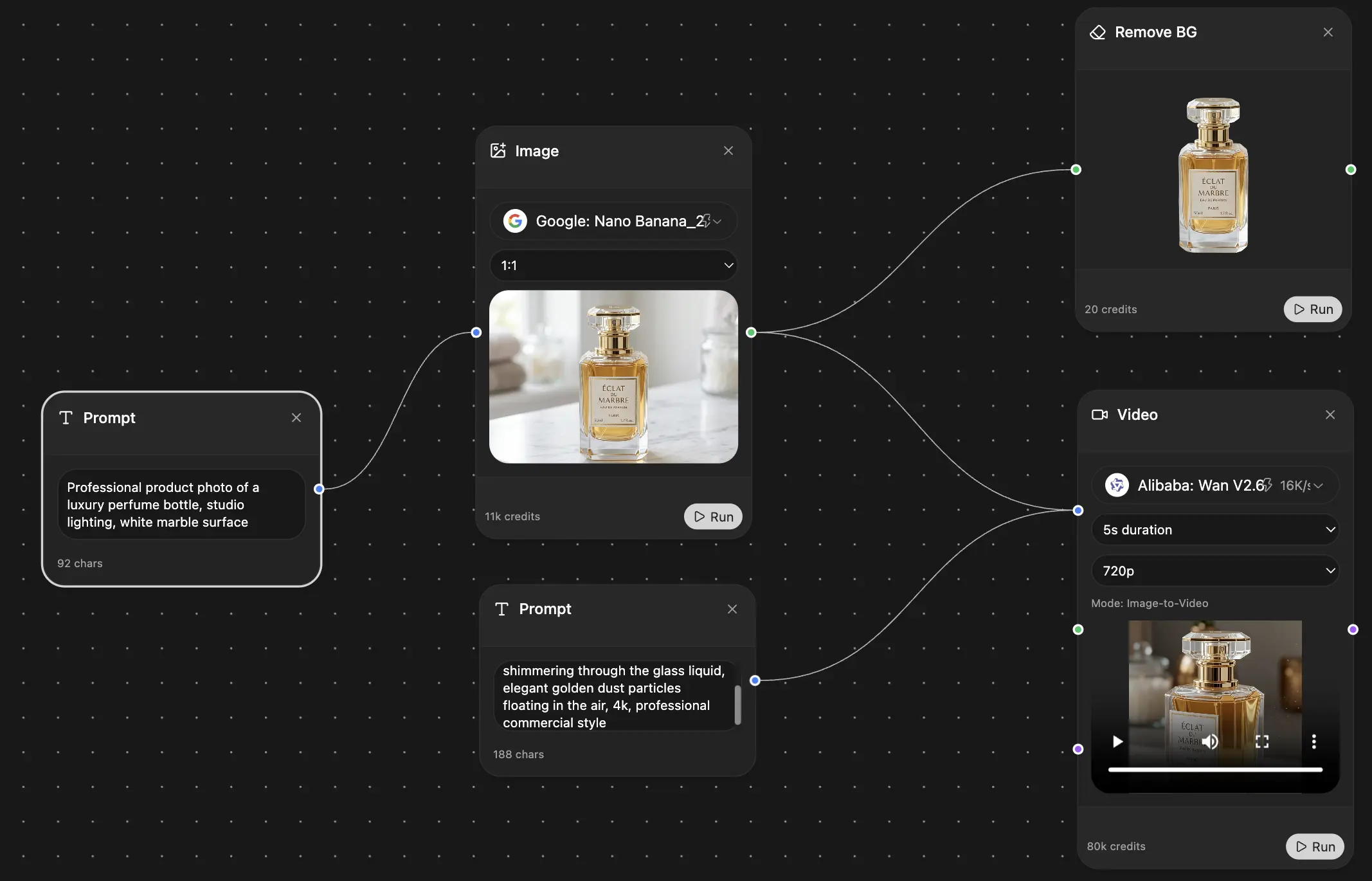
If you're juggling form UX, validation logic, copy, security notes, and post-submit workflows all at once, is worth a look. It gives you one workspace for drafting validation messages, refining frontend code, organizing research, and turning rough implementation notes into something your team can ship.
Explore Zemith Features
Every top AI. One subscription.
ChatGPT, Claude, Gemini, DeepSeek, Grok & 25+ more


Always on, real-time AI.
Voice + screen share · instant answers
What's the best way to learn a new language?
Immersion and spaced repetition work best. Try consuming media in your target language daily.
Voice + screen share · AI answers in real time
Image Generation
Flux, Nano Banana, Ideogram, Recraft + more

Write at the speed of thought.
AI autocomplete, rewrite & expand on command
Any document. Any format.
PDF, URL, or YouTube → chat, quiz, podcast & more
Video Creation
Veo, Kling, Grok Imagine and more

Text to Speech
Natural AI voices, 30+ languages
Code Generation
Write, debug & explain code
Chat with Documents
Upload PDFs, analyze content
Your AI, in your pocket.
Full access on iOS & Android · synced everywhere
Your infinite AI canvas.
Chat, image, video & motion tools — side by side
Save hours of work and research
Transparent, High-Value Pricing
Trusted by teams at
Free
No credit card required
- 100 credits daily
- 3 AI models to try
- Basic AI chat
Plus
- 1,000,000 credits/month
- 25+ AI models — GPT, Claude, Gemini, Grok & more
- Agent Mode with web search, computer tools and more
- Creative Studio: image generation and video generation
- Project Library: chat with document, website and youtube, podcast generation, flashcards, reports and more
- Workflow Studio and FocusOS
Professional
- Everything in Plus, and:
- 2,100,000 credits/month
- Pro-exclusive models (Claude Opus, Grok 4, Sonar Pro)
- Motion Tools & Max Mode
- First access to latest features
- Access to additional offers
What Our Users Say
Great Tool after 2 months usage
"I love the way multiple tools they integrated in one platform. Going in the right direction."
— simplyzubair
Best in Kind!
"The quality of data and sheer speed of responses is outstanding. I use this app every day."
— barefootmedicine
Simply awesome
"The credit system is fair, models are perfect, and the discord is very responsive. Quite awesome."
— MarianZ
Great for Document Analysis
"Just works. Simple to use and great for working with documents. Money well spent."
— yerch82
Great AI site with accessible LLMs
"The organization of features is better than all the other sites — even better than ChatGPT."
— sumore
Excellent Tool
"It lives up to the all-in-one claim. All the necessary functions with a well-designed, easy UI."
— AlphaLeaf
Well-rounded platform with solid LLMs
"The team clearly puts their heart and soul into this platform. Really solid extra functionality."
— SlothMachine
Best AI tool I've ever used
"Updates made almost daily, feedback is incredibly fast. Just look at the changelogs — consistency."
— reu0691