Image to HTML: A Developer's Guide to Clean Code in 2026
Image to html - Learn how to convert an image to HTML and CSS the right way. This practical guide covers responsive design, accessibility, and AI tools like
You probably have one of these tabs open right now: Figma, a PNG export, a landing page screenshot, or a client-approved mockup that looked harmless until someone said, “Can you turn this into HTML by today?”
That's the trap with image to html work. The design looks finished, so people assume the implementation should be quick. It isn't. A static image has one job: look right in one context. Production HTML has to survive resizing, missing fonts, content edits, keyboard navigation, weird browser behavior, and the universal law that stakeholders always want “just one small tweak” after launch.
The internet is full of two kinds of advice. One camp hand-codes everything from scratch and acts like every mockup arrives perfectly organized. The other camp pushes one-click converters that often dump out code you wouldn't wish on your future self. Absolute positioning everywhere. Nested div soup. Class names that read like a cat walked across the keyboard.
There's a better middle ground. Use AI to speed up the repetitive parts, keep developer judgment in the loop, and treat the output as a starting point, not a sacred artifact.
From Pixel Perfect Mockup to Real World Code
The first hard truth is simple. A beautiful mockup is not a web page.
Design tools describe a frozen scene. Browsers render living documents. That gap is why “convert image to html automatically” sounds better than it works in practice. Most tools can approximate appearance. Far fewer produce code that another developer can read a week later without becoming spiritually tired.
That's also the part most product pages avoid. Recent coverage of image-to-code tools points out an obvious but neglected question: do these tools generate accessible, maintainable code, or just visually similar output that still needs human review? Many pages emphasize speed and “clean HTML,” but rarely explain whether the markup uses semantic elements, ARIA labels, or passes accessibility checks, as noted in .
What good output actually means
If you're doing image to html professionally, success isn't “it looks close in Chrome on my laptop.”
Success looks more like this:
- The structure makes sense: headings are headings, navigation is navigation, lists are lists.
- The layout bends instead of breaking: content reflows on smaller screens without a panic-induced CSS patch.
- Another developer can edit it: no maze of inline styles and no pixel-by-pixel positioning for normal UI.
- QA has something testable: components behave predictably across browsers and devices.
Practical rule: If the generated code is harder to maintain than rebuilding the section by hand, the converter didn't save time. It just delayed the pain.
I've found that the useful workflow is closer to assisted implementation than direct conversion. Use a screenshot or mockup to understand intent, extract component patterns, then rebuild those patterns cleanly. If you want a closer look at that approach, this guide on is a solid companion read.
The assumption worth dropping
Stop asking, “Can this image become HTML?”
Of course it can. The better question is, what kind of HTML do you want:
That's the defining fork in the road. The browser doesn't care that the JPEG looked polished. Your users, teammates, and future deadline do.
Prepping Your Design for a Smooth Handoff
Most image to html projects go sideways before anyone writes CSS. The damage starts in the handoff. Messy layers, inconsistent spacing, missing states, random exports, and a button style that changes just enough to be annoying but not enough to be intentional.

A smooth build starts with reading the design like a system, not like a screenshot. Before touching code, pull apart the mockup into reusable chunks, note the rules, and flag inconsistencies while they're still cheap to fix.
Read the design like a component library
Don't start from the top-left corner and move downward like a printer. Scan for repetition.
Look for recurring patterns such as cards, buttons, badges, section headers, nav items, forms, and media blocks. If something appears more than once, it probably deserves a reusable component. If it appears three times with slightly different padding, you need a conversation, not another variant.
A quick component audit usually includes:
- Repeated UI blocks: hero sections, pricing cards, avatars, feature rows
- Text patterns: heading levels, body sizes, captions, labels
- Interaction states: hover, focus, active, disabled
- Asset types: icons, product shots, logos, decorative shapes
That audit turns “build this page” into “build these parts.” Much easier.
Extract the rules before the pixels
Design files often hide the underlying implementation logic. Your job is to surface it.
Create a working style reference with the basics you'll use in code:
If you skip this step, you'll end up copy-pasting one-off values everywhere. That's how a clean mockup becomes a stylesheet full of “why is this 13px here?”
A tool-assisted pass can help. If you're working from screenshots or imperfect exports, are useful for identifying visual patterns before you commit to structure and styles by hand.
Good handoff prep feels slow for about half an hour. Then it saves hours of refactoring.
Export assets like someone else might inherit the project
Asset handling is one of those boring jobs that becomes exciting only when it's done badly.
Use simple rules:
- Choose SVG for icons and logos: they scale cleanly and are easier to style.
- Use modern raster formats for photos: optimized assets load better and keep the page lighter.
- Name files clearly:
feature-card-icon-search.svgbeatsfinal-final-real-v2.svg. - Separate content from decoration: content images belong in markup, decorative flourishes often belong in CSS.
Also check whether text in the mockup is real text or baked into images. If a heading is part of the image export, you've inherited a future accessibility problem.
Building a Strong Skeleton with Semantic HTML
Here's where old-school converters usually show their limits. Historically, image-to-HTML conversion relied on OCR plus layout reconstruction. Modern tools try to preserve structure, not just text, because HTML can represent headings, lists, and tables in a meaningful way, as described in .
That sounds promising. It is. But structure preservation and semantic structure are not always the same thing.
A layout engine might correctly detect that text appears above other text. That doesn't mean it knows whether you need an h1, a section, a nav, or a figure. That decision still belongs to the developer.
Stop building pages out of div wallpaper
You can make almost anything with nested div tags. You can also eat soup with a screwdriver. The issue isn't whether it's possible. The issue is whether it's sensible.
Semantic HTML gives the page meaning:
headerfor the top intro or page mastheadnavfor navigationmainfor the primary content areasectionfor grouped contentarticlefor standalone content blocksfigureandfigcaptionfor media with context- proper heading levels for content hierarchy
That matters for screen readers, maintainability, and even simple team communication. “The nav inside the header” is a useful sentence. “The third nested wrapper inside the left container” is not.
Translate the design into document structure
When you look at a mockup, ask structure questions before style questions.
- What is the main purpose of this page?
- What content is primary versus supporting?
- Which blocks are navigation, content, promotion, or decoration?
- What heading hierarchy makes sense if all CSS disappears?
If the answer only exists visually, the code isn't ready yet.
Here's a practical mapping example:
Build the outline first
I usually write a rough HTML outline before I care about exact spacing. Something like:
- page header
- main hero
- feature section
- testimonial area
- pricing section
- footer
That gives you a readable document before CSS starts doing its dramatic theater.
If you want a gut check while you're writing markup, review your structure against basic . The same principle applies here: name things clearly, reduce noise, and prefer readable intent over clever hacks.
Rule of thumb: If you removed all CSS and the page stopped making sense, the HTML wasn't doing its job.
Semantics are part of maintainability
The biggest misunderstanding in image to html work is thinking semantics are just an accessibility concern. They're also a maintenance concern.
Semantic markup helps you:
- Target styles more cleanly
- Reduce wrapper bloat
- Make components easier to refactor
- Give accessibility work a head start instead of a rescue mission
A clean skeleton doesn't impress anyone in a screenshot. It impresses the next developer who opens the file and doesn't immediately regret being employed.
Painting the Picture with Responsive CSS
The HTML gives you the bones. CSS decides whether the thing walks or falls down a staircase.

A lot of bad image to html output comes from treating the design like a fixed poster. Real interfaces aren't posters. They stretch, collapse, wrap, crop, and occasionally reveal that the original spacing was held together by optimism.
Build layout systems, not one-off alignments
If you catch yourself nudging elements into place with lots of absolute positioning, stop. You're not recreating a museum exhibit.
Modern CSS gives you better tools:
- Flexbox for linear alignment, nav bars, card rows, button groups
- Grid for two-dimensional layout, dashboards, feature matrices, gallery-style sections
- Custom properties for tokens like spacing, colors, radius, and typography
- Relative units such as
remfor scalable spacing and text
Here's the practical split:
Don't ask, “How do I make this match the image exactly?” Ask, “What layout behavior is this design suggesting?”
Start with constraints, not breakpoints
A lot of developers begin responsive work by naming devices. Phone. Tablet. Desktop. Then they chase edge cases for the rest of the sprint.
A better approach is to watch where the layout breaks. Let the content tell you when it needs to shift. That usually produces fewer brittle rules and less “special handling” later.
Useful questions:
- When does a row need to stack?
- When does text measure become too wide?
- When do cards feel cramped?
- Which decorative details can disappear on smaller screens without harming the content?
Responsive CSS works better when you define relationships between elements, not exact positions.
For typography, use a sensible scale and preserve hierarchy. For spacing, favor rhythm over pixel worship. Mockups often contain tiny visual differences that don't need to survive into production unless they carry meaning.
A short demo helps if you're explaining responsive layout to teammates or junior devs:
The email version is a different sport
Web pages and HTML emails share words like “HTML” and “CSS,” which has misled many innocent people.
When converting an image to HTML/CSS for email, you get a tradeoff. You preserve brand styling and keep text searchable, but you also introduce rendering issues. The HTML can fail differently than the original image, so cross-client QA is mandatory across clients like Gmail, Outlook, and Apple Mail, as explained in .
That means your responsive strategy for email needs extra caution:
- Keep layout simpler: email clients punish ambition.
- Expect CSS support gaps: what works on the web may not behave in inboxes.
- Test actual clients, not assumptions: Outlook has a special talent for humbling people.
CSS details that pay off later
Small decisions matter more than flashy techniques here.
- Create variables early: color, spacing, font sizes, shadows.
- Use container-friendly images: avoid fixed widths that fight the layout.
- Reserve hover effects for where they make sense: don't build UX around behavior touch devices don't have.
- Keep selectors readable: if a selector looks like an archaeological record, it's already too much.
The goal isn't just visual fidelity. It's resilient fidelity. Close enough to the mockup, flexible enough for the web, and clean enough that future edits don't require a ceremonial rewrite.
The AI Supercharge A Smarter Workflow with Zemith
Manual image to html work is still the baseline skill. You need to understand structure, layout, and accessibility whether AI is in the room or not.
But there's no prize for suffering through boilerplate by hand. If a tool can help you draft a component, translate a screenshot into a usable starting point, explain why your Grid isn't behaving, or preview a fix quickly, use the tool.

Where AI actually helps
The useful AI workflow is narrow and practical. It helps with the tedious middle, not the final judgment.
Good uses include:
- Scaffolding component markup: generate a first pass for cards, hero blocks, pricing sections
- Drafting CSS structure: set up Grid, Flexbox, spacing tokens, and base styles
- Translating visual prompts into code ideas: useful when the design intent is obvious but the implementation path is annoying
- Debugging awkward layout issues: especially alignment bugs that somehow only appear when someone important is watching
Bad uses are just as important to name:
- trusting generated markup without reviewing semantics
- copying CSS wholesale without checking responsive behavior
- assuming screenshot-based output understands content hierarchy
- shipping “looks right on first glance” code without QA
AI is a force multiplier for developers who can review output. It is a mess multiplier for developers who can't.
A realistic workflow instead of the magic button fantasy
Here's the version that works without creating future cleanup tickets.
1. Isolate the mockup into parts
Don't feed an entire busy page into a generator and hope for enlightenment. Work component by component. Header. Hero. Card. Feature list. Form. Keep the problem small enough that you can judge the output quickly.
2. Ask for intent, not just appearance
Instead of “make this screenshot into HTML,” prompt for structure:
- build a semantic hero section
- use Grid for the card layout
- include accessible button markup
- keep class names readable
- avoid absolute positioning unless necessary
That last one saves a shocking amount of nonsense.
3. Treat the output like a junior dev's first draft
This is the mindset that keeps AI useful. Review it. Rename things. Remove wrappers. Replace vague classes. Tighten spacing tokens. Fix heading order. Add missing states.
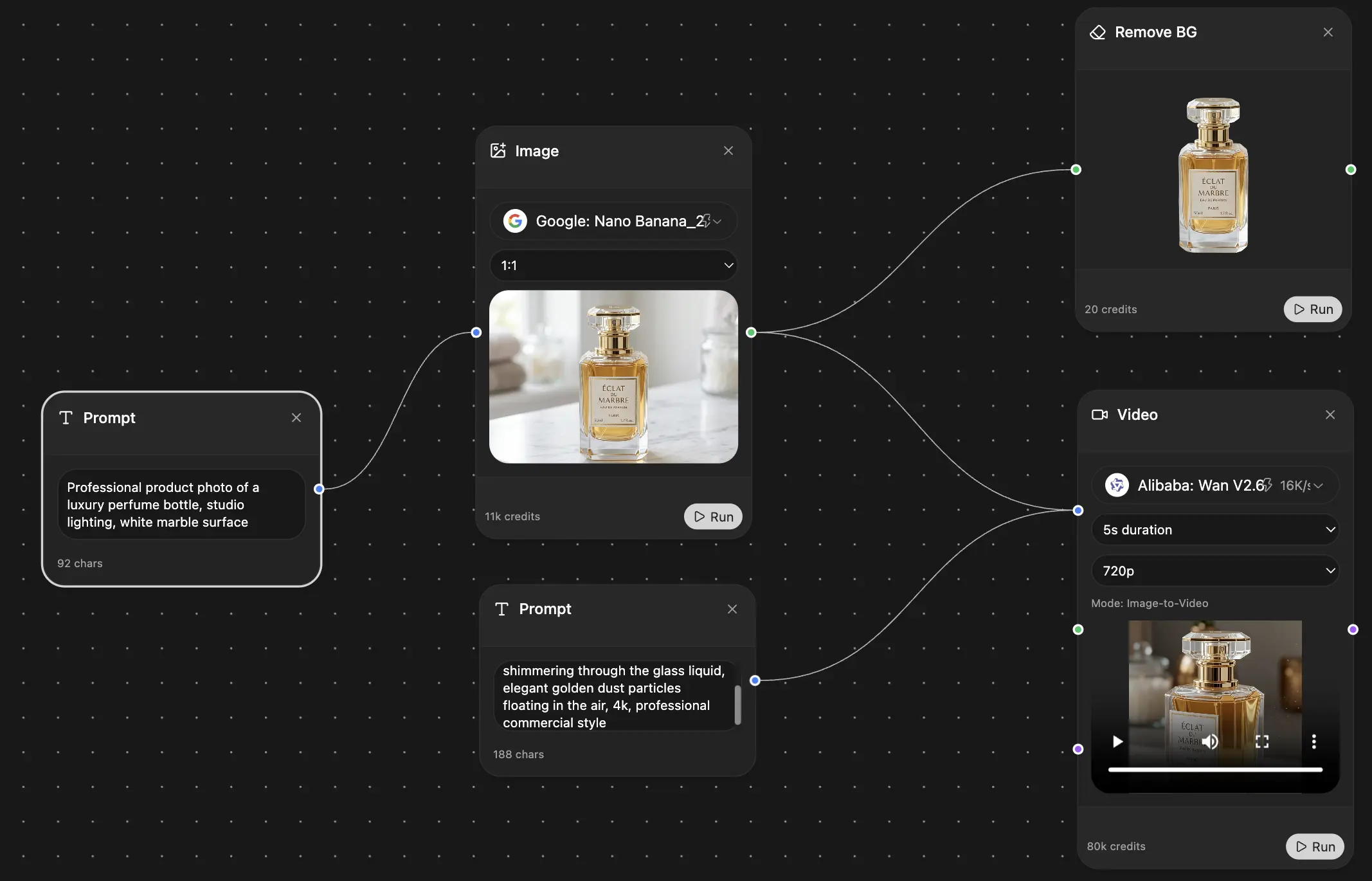
One practical option is , combined with its coding assistant and live preview, to turn visual references into a starting HTML/CSS prototype and iterate on the result inside the same workspace. That's a sensible use of AI because it speeds up translation and debugging, not because it magically eliminates engineering.
What to check before you keep the generated code
Use a short review gate. If the output fails this, rebuild or heavily refactor it.
A lot of AI-generated code gets the first screenshot mostly right and the second state completely wrong. That's normal. The value is speed to draft, not guaranteed production readiness.
The boring work AI should absorb
I'm happy to let a tool help:
- repetitive wrapper setup
- CSS variable scaffolding
- translating spacing patterns into reusable classes or component styles
- producing quick prototypes for stakeholder review
- generating alternate versions so you can compare implementation choices faster
What I won't outsource is the final architecture. AI can suggest. The developer still decides what belongs in the codebase.
Because once the launch adrenaline wears off, someone has to maintain that component. Usually you. Which is why the “one-click image to html converter” dream tends to age like milk.
Final Polish Testing and Performance Optimization
The page looks good on your machine. Congratulations. That means almost nothing.
Production quality shows up in the final checks. This is the stage most rushed projects skip, then rediscover through bug reports, layout drift, and someone in Slack posting a screenshot with “looks weird on my phone?”

A fast quality gate
Run through four passes before calling the work done.
Performance
Check image formats, dimensions, and loading behavior. Don't ship giant assets because the mockup export was convenient. Make sure decorative images aren't carrying content responsibility, and keep font loading from turning your text into a suspense sequence.
Accessibility
Verify keyboard navigation, focus visibility, heading order, alt text, labels, and color contrast. If the page only works for mouse users with perfect vision, the conversion is unfinished.
Responsiveness
Resize aggressively. Not just common widths. Drag the browser and look for the exact moment things collapse awkwardly, wrap badly, or create accidental horizontal scroll.
Content resilience
Swap in longer headlines and messier real content. Mockups often use idealized copy. Production rarely does.
Quality gate: If a layout only survives with the original placeholder text, it isn't stable yet.
Use visual regression, not tired eyeballs
For image to html work, screenshot comparison is one of the few QA methods that maps directly to the job.
Controlled studies on presentation failures found that image-comparison testing detected failures with 100% accuracy and identified result sets containing the faulty HTML element in over 77% of cases, according to the USC study on presentation failure detection. That's a strong case for visual regression as part of your workflow.
The practical version is straightforward:
- Render the converted HTML in target browsers.
- Capture baseline screenshots.
- Compare them against the design reference or approved render.
- Investigate mismatched regions instead of staring at screens until your will to live fades.
If you want to tighten your release process more broadly, these fit well with front-end QA workflows.
Final checks worth keeping as a habit
- Test with real fonts loaded and with fallback fonts
- Check focus states on interactive elements
- Review spacing at awkward intermediate widths
- Inspect for unnecessary wrappers and dead CSS
- Confirm images and icons stay sharp without breaking layout
The last mile is where solid front-end work separates itself from a nice-looking prototype. Anyone can get close. Professionals make it hold up.
Conclusion The Modern Coder's Way
Image to html isn't a button. It's a workflow.
The strongest results come from a hybrid approach. Start by cleaning up the handoff. Build semantic structure that reflects the content, not just the pixels. Recreate the visual design with responsive CSS that can survive the live web. Then use AI where it genuinely helps: drafting, translating, debugging, and speeding up repetitive implementation work.
That's the difference between a demo and production code.
A mockup can be exact. A website has to be useful. It has to handle content changes, accessibility requirements, browser differences, and future edits from someone who didn't sit in the original design review. If your conversion process ignores those constraints, it's not finished.
The good news is that you don't need to choose between painfully manual work and junk output from a one-click converter. You can use AI as an assistant, keep engineering judgment in charge, and end up with code that still makes sense next month.
If you want one workspace for turning visual ideas into usable code, reviewing structure, iterating with live previews, and handling the annoying parts faster, is worth trying. It fits best as a developer aid, not a magic replacement for front-end judgment.
Explore Zemith Features
Every top AI. One subscription.
ChatGPT, Claude, Gemini, DeepSeek, Grok & 25+ more


Always on, real-time AI.
Voice + screen share · instant answers
What's the best way to learn a new language?
Immersion and spaced repetition work best. Try consuming media in your target language daily.
Voice + screen share · AI answers in real time
Image Generation
Flux, Nano Banana, Ideogram, Recraft + more

Write at the speed of thought.
AI autocomplete, rewrite & expand on command
Any document. Any format.
PDF, URL, or YouTube → chat, quiz, podcast & more
Video Creation
Veo, Kling, Grok Imagine and more

Text to Speech
Natural AI voices, 30+ languages
Code Generation
Write, debug & explain code
Chat with Documents
Upload PDFs, analyze content
Your AI, in your pocket.
Full access on iOS & Android · synced everywhere
Your infinite AI canvas.
Chat, image, video & motion tools — side by side
Save hours of work and research
Transparent, High-Value Pricing
Trusted by teams at
Free
No credit card required
- 100 credits daily
- 3 AI models to try
- Basic AI chat
Plus
- 1,000,000 credits/month
- 25+ AI models — GPT, Claude, Gemini, Grok & more
- Agent Mode with web search, computer tools and more
- Creative Studio: image generation and video generation
- Project Library: chat with document, website and youtube, podcast generation, flashcards, reports and more
- Workflow Studio and FocusOS
Professional
- Everything in Plus, and:
- 2,100,000 credits/month
- Pro-exclusive models (Claude Opus, Grok 4, Sonar Pro)
- Motion Tools & Max Mode
- First access to latest features
- Access to additional offers
What Our Users Say
Great Tool after 2 months usage
"I love the way multiple tools they integrated in one platform. Going in the right direction."
— simplyzubair
Best in Kind!
"The quality of data and sheer speed of responses is outstanding. I use this app every day."
— barefootmedicine
Simply awesome
"The credit system is fair, models are perfect, and the discord is very responsive. Quite awesome."
— MarianZ
Great for Document Analysis
"Just works. Simple to use and great for working with documents. Money well spent."
— yerch82
Great AI site with accessible LLMs
"The organization of features is better than all the other sites — even better than ChatGPT."
— sumore
Excellent Tool
"It lives up to the all-in-one claim. All the necessary functions with a well-designed, easy UI."
— AlphaLeaf
Well-rounded platform with solid LLMs
"The team clearly puts their heart and soul into this platform. Really solid extra functionality."
— SlothMachine
Best AI tool I've ever used
"Updates made almost daily, feedback is incredibly fast. Just look at the changelogs — consistency."
— reu0691