How to Write Technical Reports That Drive Action
Learn how to write technical reports that are clear, professional, and persuasive. Discover proven strategies to plan, write, and present your data successfully.
Writing a technical report isn't just about putting facts on a page. It's about translating complex information into something clear, precise, and genuinely useful. You’re defining who you’re talking to, organizing your data so it tells a story, and writing in a way that builds trust and gets your point across without any fluff.
Why Great Technical Reports Advance Your Career
Let's be honest, for many people, report writing feels like a chore. It's that last tedious thing you have to do after all the real work is finished. But that mindset misses a huge opportunity. A great technical report is one of the most powerful—and underrated—tools you have for getting ahead in your career.
Think of it this way: your report is a direct reflection of your thinking. It shows off your analytical skills, your attention to detail, and your ability to explain complex stuff to people who might not live and breathe it every day. A well-written report can be the very thing that secures funding for your project, convinces leadership to try a new approach, or stops a costly mistake in its tracks.
When you deliver a report that’s clear, persuasive, and insightful, you’re not just handing in a document. You're building a case for your own expertise.
Turning Documentation Into Influence
Every report you write is a chance to think strategically. Don't just list data points—tell a story. Connect the technical details to what actually matters for the business. You have to answer the "so what?" that's always on the minds of executives and decision-makers.
For example, a software engineer’s bug analysis can be a dry, technical list of errors. Or, it can be a compelling argument for why the team needs to dedicate resources to refactor a critical piece of code, spelling out the real-world risks like lost revenue or security vulnerabilities.
This skill is only becoming more important. The U.S. Bureau of Labor Statistics projects a 7% increase in jobs for technical writers between 2022 and 2032. That's because as technology gets more complicated, the need for people who can translate technical jargon into business strategy grows right along with it. If you're curious, you can explore more on the future of technical writing to see where things are heading.
The difference between a good team member and an indispensable one often comes down to communication. A brilliant idea is worthless if you can't explain it clearly to the people who need to approve, fund, or build it.
Becoming an Indispensable Team Member
When you get really good at writing technical reports, you stop being just a "doer" and start becoming a strategic influencer. Your colleagues and managers will know they can count on you to deliver reports that are not only accurate but also easy to grasp and act on. That’s how your professional reputation grows.
Just think about these real-world situations where a single report made all the difference:
- Securing Funding: A project manager's feasibility report, complete with sharp data visualizations and a killer executive summary, convinces stakeholders to greenlight a new initiative with a $500,000 investment.
- Preventing Errors: An operations analyst writes an incident report that nails the root cause of a system failure. This leads directly to a process change that prevents future outages, saving the company a fortune in downtime.
- Driving Innovation: A research scientist’s report on new experimental findings is so persuasive that it convinces the R&D department to pivot its entire focus, which eventually leads to a breakthrough product.
In every one of these cases, the report was the engine for progress. Once you start seeing report writing as a chance to show your value, it stops being a chore and becomes a serious career-building move.
Blueprint for Success: Planning Your Report

A great technical report doesn’t just happen. It’s built on a solid foundation laid long before you type the first word. Jumping straight into writing without a plan is the fastest way to create a document that's confusing, unfocused, and ultimately, ineffective. This initial planning stage is where you do the real work—the work that makes your report not just informative, but influential.
It all boils down to one simple, yet critical, question: Why am I writing this?
Getting this right is the first real step in writing a technical report that actually gets results. Don't just settle for a vague answer. You need a specific, measurable objective. For instance, "to document the new system" isn't a strong purpose.
A much better objective is "to demonstrate the new system's 25% efficiency gain to secure executive approval for a company-wide rollout." See the difference? That level of clarity instantly dictates your content, your tone, and the data you need to highlight.
Pinpoint Your Purpose and Audience
Once you know your "why," you have to figure out your "who." A report's success is ultimately judged by its impact on the reader, and you can’t make an impact if you don’t know who you’re talking to. You need a clear picture of their needs, what they already know, and what they expect to get from your document.
Think about who's going to be reading this:
- C-Suite Executives: They're busy and care about the bottom line. Give them the key findings, financial impact, and your recommendations right up front in the executive summary. They almost certainly won't dig into the dense technical appendices.
- Project Managers: They need to know about timelines, resources, and risks. Your report should give them a clear snapshot of the project's status and flag any potential roadblocks.
- Fellow Engineers: This is your most technical audience. They'll want the detailed methodology, the raw data, and a deep dive into the analysis. You can use the specific jargon here that you'd have to explain to anyone else.
One of the most common mistakes I see is a failure to tailor the content to the audience. Dropping raw, unfiltered data on an executive is just as useless as oversimplifying your complex findings for a fellow engineer.
Gather and Organize Your Information
With a clear purpose and audience in mind, you can start pulling your information together. This isn't just about data collection; it's about curating the specific evidence that directly supports your objective and will resonate with your readers.
This is where having a centralized workspace can be a game-changer. Instead of digging through old emails, scattered chat logs, and random files, using a platform like can help you bring all your project data, research, and team notes into one organized hub. This creates a single source of truth, ensuring your report is built on accurate and complete information from the get-go.
A report is only as strong as the data it's built on. A disorganized information-gathering process will inevitably lead to a disorganized and unconvincing report.
Create a Logical Outline
Before you even think about writing full paragraphs, build a detailed outline. Your outline is the architectural blueprint for the report. It ensures every piece of information has a logical home and contributes to the main argument. An outline is your best defense against rambling and losing focus.
Don't just jot down the main section headings. Flesh them out with the key points and evidence you plan to include in each one. For a major efficiency boost, you can use the AI-powered tools at to generate a structured outline from your initial research notes, giving you a solid starting point in seconds.
For example, a section on "Results" in your outline shouldn't be a one-word placeholder. It should look more like this:
- Results
- Performance Metrics: Present key data from stress tests, noting the 15% reduction in server response time.
- User Feedback Analysis: Summarize qualitative findings from the beta testing group, highlighting three major usability improvements.
- Comparison to Previous System: Use a table to show a side-by-side performance comparison.
This level of detail transforms your outline from a simple list into a practical roadmap. It breaks the daunting task of writing an entire report into a series of smaller, manageable steps, making the actual writing process much faster and more coherent.
Laying Out Your Professional Technical Report
Okay, you've done the planning. Now it's time to build the skeleton of your document. A great technical report isn't just a brain dump of data; it's a carefully constructed argument that walks your reader from a problem to a compelling solution. The right structure turns complex information into a clear, persuasive narrative.
Think of it as a logical flow. You start with the big picture, dive into the specifics, present what you found, and then explain what it all means.
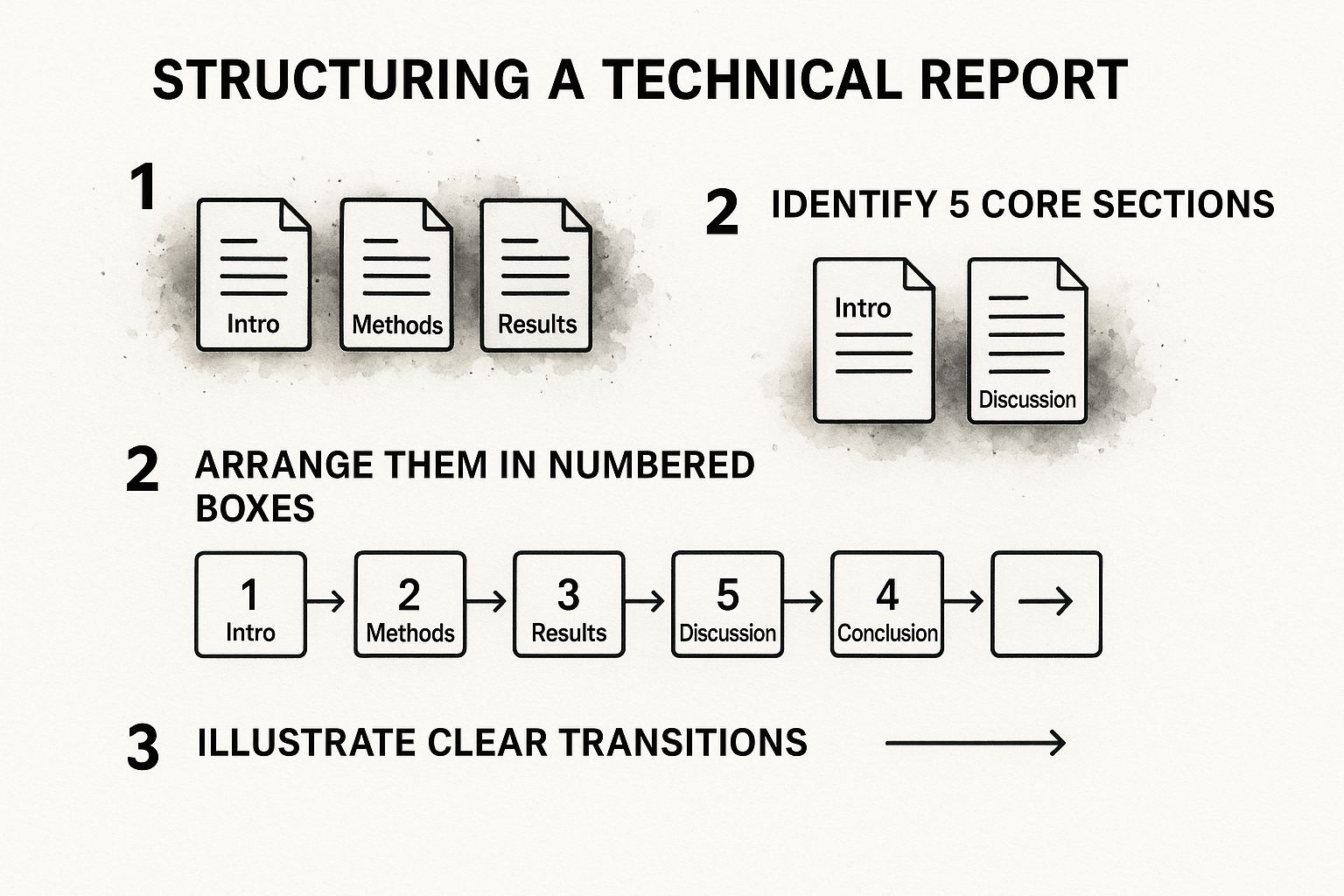
This visual really captures that essential arc—setting the stage in the intro, showing your work in the methods, delivering the goods in the results, and then connecting the dots in the discussion and conclusion.
First Impressions: The Preliminary Sections
Before anyone gets into the nitty-gritty of your work, they'll see the opening sections. These are your first—and sometimes only—chance to make an impact, so they need to be sharp.
- Title Page: This is your report's business card. It needs the report’s title, your name (and any co-authors), the date, and your organization. The title itself is crucial—make it descriptive enough to tell a stranger exactly what's inside, but keep it concise.
- Executive Summary: This is arguably the most important page. Busy executives and managers might only read this, so it has to stand on its own. Think of it as the entire report in miniature. It must quickly cover the problem, your approach, the most critical findings, and your final recommendations.
Your executive summary needs to pack a punch. Keep it direct, persuasive, and under 250 words.
Getting into the Details: The Core of Your Report
The main body is where you lay out your work for everyone to see. Each piece has a job to do, and sequencing them correctly is the secret to a report that’s easy to follow and understand.
A well-structured report guides the reader logically. I've found it helpful to think of the core components in a table to keep their purpose front and center during the writing process.
Here’s a practical breakdown of those standard sections and what each one needs to accomplish:
Core Components of a Technical Report
This table acts as a great checklist to ensure you’re hitting all the essential points as you draft each part of your report.
Breaking Down the Introduction and Methodology
The Introduction is where you hook the reader. It needs to clearly define the problem you're tackling, give just enough background for them to understand why it matters, and spell out the report’s objective. In short, you're telling them what you're about to tell them.
Right after, the Methodology section answers the "how." This is all about transparency and repeatability. You need to describe your process, tools, and materials in enough detail that another expert in your field could follow your steps and, ideally, get the same results. For complex projects, keeping track of every procedure and data point is a nightmare. Using a centralized workspace like can be a lifesaver for keeping this information organized and accurate.
Presenting Your Results and Discussing Them
In the Results section, you simply present the data. Stick to the facts. Use charts, tables, and graphs to show your findings clearly and objectively—this isn't the place for your opinions or interpretations just yet.
The Discussion is where your expertise truly shines. This is your chance to move beyond the "what" and explain the "so what." You interpret the results, analyze what they mean, and tie everything back to the problem you laid out in the introduction.
This is where you show off your analytical thinking. What are the real-world implications of what you found? Were there any surprises? How do your findings stack up against other work in the field?
Wrapping It Up: The Conclusion and Supporting Materials
Finally, you need to bring your report to a clean close and provide all the necessary backup material. These last sections are what make your work a complete, credible package.
Industry standards for technical reports always come back to clarity and structure. Research from organizations like the Institution of Engineering and Technology (IET) confirms that a great report relies on a precise title, a logical format, and distinct sections. It’s also worth remembering that visual data is king—studies show that 60-70% of technical readers grasp information better from diagrams and graphs than from dense paragraphs of text. You can find more practical advice in .
- Conclusion: This is your final summary. Briefly restate your main points and most important findings. You shouldn't introduce anything new here, but you should leave the reader with a powerful final takeaway. This is also the natural place for your final recommendations.
- References: Always cite your sources properly. It’s not just academic; it gives your work credibility and points interested readers toward further information.
- Appendices: This is the home for anything that's important but too detailed for the main report. Think raw data tables, long calculations, or lengthy code blocks.
Writing with Precision and Authority

Alright, you've got your plan and a solid structure. Now it’s time to actually write the thing. This is where all that prep work pays off, allowing you to focus on crafting sentences that are not just accurate, but also clear, concise, and authoritative.
Think of it this way: your credibility is on the line with every word. If your writing is bogged down by complex sentences, vague language, or a passive tone, you’ll undermine the very data you’re trying to present. Clear, direct writing, on the other hand, establishes your expertise and makes your findings impossible to ignore.
Embrace the Active Voice
Want a quick way to make your writing instantly more powerful? Use the active voice. It’s a simple change that makes a world of difference.
Active voice puts the subject of your sentence in charge—making it crystal clear who is doing what. This results in more energetic and readable prose. The passive voice, however, often makes your writing feel indirect and a bit clumsy. It can even make it seem like you're hiding who is responsible for an action.
Here’s a classic example:
- Passive: The system was updated by the engineering team.
- Active: The engineering team updated the system.
See the difference? The active version is shorter and gets straight to the point. It tells you who did what. While the passive voice has its uses—say, when the action is more important than who did it—you should be writing in the active voice at least 80-90% of the time.
A good mental check is to ask, "Who or what is doing the action?" If the subject of the sentence is the answer, you're using the active voice. This small habit will dramatically improve your technical reports.
Keep It Simple and Cut the Clutter
Technical topics are already complex. Your goal is to simplify, not to show off your vocabulary. That means picking simple words over complicated ones and being ruthless about cutting anything that doesn’t add real value.
Every word needs to earn its spot. Keep an eye out for filler phrases and redundant words that just take up space.
Let’s look at a real-world example of trimming the fat:
- Before: In order to achieve the desired outcome, it is absolutely essential that the team utilizes the new software protocols for the purpose of data verification.
- After: The team must use the new software protocols to verify data.
The "after" version says the exact same thing in half the words. It's direct, professional, and much easier to read. If you’re looking to sharpen these skills further, our guide on is a great next step.
Manage Jargon and Maintain Objectivity
It's a technical report, so of course there will be jargon. That's perfectly fine, but only if your audience is on the same page. If you're writing for a mix of experts and non-experts, define any specialized terms the first time you use them or add a glossary. Never assume everyone knows what an acronym stands for.
Just as important is maintaining an objective, fact-based tone. Your report should be built on hard evidence, not personal feelings. Ditch subjective words like "amazing," "terrible," or "unfortunately." Let the data do the talking.
- Subjective: We saw a fantastic improvement in server response time.
- Objective: Server response time decreased by 22%.
The objective statement is far more credible because it’s precise. It gives the reader real information to work with.
Using Visuals and Tools to Enhance Clarity
Let's be honest, walls of text can kill even the most groundbreaking findings. Your report could be brilliant, but if it's a dense sea of words, your key points will get lost. This is where visuals come in. Think of graphs, charts, and diagrams not as decoration, but as powerful storytelling tools that help your audience see what you mean in an instant.
The trick is to pick the right tool for the right job. You wouldn't use a screwdriver to hammer a nail, and you shouldn't use a pie chart to show a trend over time. Every visual has its own strength, and the magic happens when you match the visual to the data you're trying to explain.
Choosing the Right Visual for Your Data
Your goal here is to make your data sing, not to create a puzzle. A well-chosen visual should make complex information immediately obvious. Keep your designs clean, simple, and laser-focused on the main takeaway.
- Line Graphs: These are your go-to for showing how things change over time. Think system performance metrics from January to June or bug reports logged per week.
- Bar Charts: Perfect for comparing different items in the same category. Use them to show defect rates across various software modules or to compare the performance of different servers.
- Pie Charts: Use these sparingly. They're only really effective for showing parts of a single whole, like the percentage breakdown of a project's budget. If you have more than a few slices, they get messy fast.
- Tables: When exact numbers are critical, nothing beats a clean table. It's the best way to present precise numerical data in a structured format where the actual values matter more than a visual trend.
Whatever you choose, simplicity is your best friend. Ditch the clutter, use clear labels, and pick colors that help people understand the information, not distract them. For a deeper look at this, our guide on has some great, practical tips.
Streamlining Visual Creation with Modern Tools
Building charts and graphs by hand is not only a drag, but it's also where mistakes can creep in. Thankfully, we don't have to do that anymore. Modern tools can handle the heavy lifting, saving you time and improving accuracy so you can focus on interpreting the data, not just plotting it.
For example, a project management tool like Zemith.com can generate performance charts and progress reports automatically from the data you're already tracking. Instead of the old-school copy-paste routine, you can just embed live, dynamic visuals right into your report. This is a game-changer. It doesn't just save a ton of time; it ensures your report is always showing the latest, most accurate data.
And if you're curious about the tech behind some of the smarter writing assistants and grammar checkers that help polish these reports, you can to see how it all works.
The best visual isn't the most complex—it's the one that tells a clear, accurate story with the least amount of effort from the reader. If your audience has to struggle to interpret your chart, it has failed.
This shift toward visual, dynamic reporting is only going to accelerate. By 2025, expect to see multimedia content like videos and interactive diagrams become standard practice. After all, studies show that 99.5% of field technicians already use mobile devices to look up documentation, and they need content that's easy to digest on a small screen. You can to stay ahead of the curve.
The Final Polish: Editing and Proofreading

You’ve poured everything into drafting the report, but don’t hit send just yet. This final review stage is what separates a decent document from a polished, professional one. Skipping this part is a rookie mistake; it’s like building a complex machine and never bothering to run a final diagnostic. All your hard work could be undermined by a few avoidable errors.
This isn’t just a quick spell-check. It’s your last chance to see the report through your audience's eyes. Does it truly answer their questions? Is your main point impossible to miss?
Strategies for Effective Self-Editing
Before you hand your report over for feedback, the first round of edits is on you. It's tough to spot your own mistakes when you've been staring at the same text for hours, but a few proven techniques can make all the difference.
Take a Break: Seriously, step away. Give it at least a few hours, or even a full day if you can. When you come back, awkward phrasing and logical gaps you were blind to before will suddenly jump out.
Read It Aloud: This feels silly, but it works. Hearing the words forces you to slow down and catch clunky sentences and run-on paragraphs that your eyes would otherwise glide right over.
Focus on One Thing at a Time: Don’t try to fix everything at once. Run through the document multiple times, each with a specific goal. One pass for flow and structure, another for grammar, and a final one just for formatting.
The real goal of self-editing isn't just to fix typos—it's to sharpen your message. Every single sentence should serve the report's primary objective. If it doesn't add value, be ruthless and cut it.
For a deeper dive, our guide on offers a more structured framework with advanced techniques. This final check is what ensures your report lands with the authority and credibility it deserves.
Questions We Hear All the Time
Even with a solid plan, a few questions always pop up when it's time to actually start writing. Let's tackle some of the most common ones I get asked about putting together technical reports that actually work.
So, How Long Should This Thing Be?
Honestly, there’s no magic number. A report’s length is dictated by its purpose and who’s reading it, not some arbitrary page count. I've seen brilliant one-page incident summaries and exhaustive research analyses that were necessarily 50+ pages long.
The real goal is to get all the essential information across as efficiently as you can. Focus on being thorough without the fluff. Clarity always wins over a high page count.
What's the One Mistake I Absolutely Have to Avoid?
If there's one pitfall that sinks more reports than any other, it's forgetting who you're writing for. It's a classic, costly error.
Picture this: you send a report packed with dense engineering jargon to the executive team. They won't get it. Your hard work and critical insights will be completely lost in translation. On the flip side, dumbing down your analysis for a team of fellow specialists can make you look like you don't know your stuff.
A great report isn't just about what you say, but how you say it. Thinking about your audience is the single most important step you can take to make sure your report gets read, not ignored.
How Do I Make a Technical Report… Not Boring?
Let's be real, a technical report doesn't need to read like a novel, but it absolutely has to be readable. The best way to engage your reader is to make their job easy. That starts with a clean structure and headings that act like a roadmap, telling them exactly what's in each section.
Beyond that, here are a few simple tricks that make a huge difference:
- Keep your paragraphs tight. Stick to one main idea per paragraph. Two or three sentences is usually perfect.
- Show, don't just tell. Well-designed charts, tables, and diagrams are your best friends. They break up walls of text and make complex data digestible at a glance.
- Nail the executive summary. This is your hook. Start strong by putting your most critical findings and recommendations right at the top.
Focusing on these elements makes your report feel less like a chore and more like a valuable, accessible resource.
Ready to put these ideas into practice and seriously upgrade your workflow? Zemith brings AI-powered tools for research, writing, and data analysis together in one spot. Think of it as your assistant for everything from building an outline to summarizing dense source material, helping you create polished, professional reports in a fraction of the time. .
Explore Zemith Features
Every top AI. One subscription.
ChatGPT, Claude, Gemini, DeepSeek, Grok & 25+ more


Always on, real-time AI.
Voice + screen share · instant answers
What's the best way to learn a new language?
Immersion and spaced repetition work best. Try consuming media in your target language daily.
Voice + screen share · AI answers in real time
Image Generation
Flux, Nano Banana, Ideogram, Recraft + more

Write at the speed of thought.
AI autocomplete, rewrite & expand on command
Any document. Any format.
PDF, URL, or YouTube → chat, quiz, podcast & more
Video Creation
Veo, Kling, Grok Imagine and more

Text to Speech
Natural AI voices, 30+ languages
Code Generation
Write, debug & explain code
Chat with Documents
Upload PDFs, analyze content
Your AI, in your pocket.
Full access on iOS & Android · synced everywhere
Your infinite AI canvas.
Chat, image, video & motion tools — side by side
Save hours of work and research
Transparent, High-Value Pricing
Trusted by teams at
Free
No credit card required
- 100 credits daily
- 3 AI models to try
- Basic AI chat
Plus
- 1,000,000 credits/month
- 25+ AI models — GPT, Claude, Gemini, Grok & more
- Agent Mode with web search, computer tools and more
- Creative Studio: image generation and video generation
- Project Library: chat with document, website and youtube, podcast generation, flashcards, reports and more
- Workflow Studio and FocusOS
Professional
- Everything in Plus, and:
- 2,100,000 credits/month
- Pro-exclusive models (Claude Opus, Grok 4, Sonar Pro)
- Motion Tools & Max Mode
- First access to latest features
- Access to additional offers
What Our Users Say
Great Tool after 2 months usage
"I love the way multiple tools they integrated in one platform. Going in the right direction."
— simplyzubair
Best in Kind!
"The quality of data and sheer speed of responses is outstanding. I use this app every day."
— barefootmedicine
Simply awesome
"The credit system is fair, models are perfect, and the discord is very responsive. Quite awesome."
— MarianZ
Great for Document Analysis
"Just works. Simple to use and great for working with documents. Money well spent."
— yerch82
Great AI site with accessible LLMs
"The organization of features is better than all the other sites — even better than ChatGPT."
— sumore
Excellent Tool
"It lives up to the all-in-one claim. All the necessary functions with a well-designed, easy UI."
— AlphaLeaf
Well-rounded platform with solid LLMs
"The team clearly puts their heart and soul into this platform. Really solid extra functionality."
— SlothMachine
Best AI tool I've ever used
"Updates made almost daily, feedback is incredibly fast. Just look at the changelogs — consistency."
— reu0691