How to Analyze Research Data Without Losing Your Mind
Discover how to analyze research data with our practical guide. We'll cover essential methods, from data cleaning to AI-powered analysis, to find real insights.
Staring at a mountain of research data can feel like you're about to climb Everest in flip-flops. It's overwhelming. But turning that raw information into a compelling, actionable story isn't magic—it's a process. To do it right, you need to move through four distinct phases: preparation, exploration, analysis, and storytelling.
Demystifying the Research Analysis Process

Before you even think about running complex statistical models, it helps to understand the full journey from messy data to clean insight. Don't see it as one giant task. Instead, think of it as a series of manageable stages, each with its own clear goal. This roadmap keeps you from getting lost in endless spreadsheets and ensures you stay focused on what really matters: answering your core research questions.
Ultimately, this whole process is about transforming numbers and text into knowledge. It's the critical bridge between collecting information and using it to make smarter decisions. Without a solid analysis plan, even the most promising research can fall flat, leaving you with a pile of interesting facts but no real direction. And let's be real, nobody gets a promotion for a "pile of interesting facts."
The Core Goal of Data Analysis
At its heart, the goal is pretty simple: find the patterns, trends, and relationships that directly answer your research question. Are you trying to pinpoint what drives customer behavior? Validate a scientific hypothesis? Or measure the true impact of a new marketing campaign? Whatever it is, your analysis needs to be laser-focused on that objective.
That focus is more important than ever. The sheer volume of data we generate is staggering—by 2025, it's projected to hit roughly 182 zettabytes worldwide. To keep up, nearly 61% of global companies are now using big data and analytics technologies. This explosion highlights just how critical efficient analysis techniques have become. You can dive deeper into these big data trends and their implications for modern businesses.
A successful analysis never just presents data. It interprets it, providing the crucial "so what?" behind the numbers.
Data analysis is the art of asking the right questions to your data to uncover the story hidden within. It’s about moving beyond what the numbers say to what they actually mean for your project or business.
This quick table breaks down the entire workflow into its essential stages.
The Four Phases of Research Data Analysis
Following these phases in order brings structure and reliability to your work.
Why a Structured Approach Matters
Jumping straight into analysis without a plan is like trying to build a house without a blueprint. You might get a wall up here and there, but the whole thing is likely to collapse. A structured approach ensures your work is methodical, repeatable, and far less prone to the kind of errors and biases that can sink a project.
This methodical workflow is essential for a few key reasons:
- Clarity and Focus: It keeps you tethered to your research objectives, preventing you from getting sidetracked by interesting but irrelevant tangents.
- Efficiency: Knowing what’s next saves a ton of time and reduces the mental energy you spend just trying to figure out your next move.
- Trustworthiness: A documented, logical process makes your findings more credible and much easier for others to understand and verify.
This is exactly why platforms like are built around a structured workflow. By integrating tools for document organization, AI-powered summarization, and data exploration into a single workspace, it helps you manage each phase without constantly jumping between different apps. The idea is to keep your entire project—from raw data to final report—organized and accessible. The goal? Spend less time wrestling with your tools and more time actually discovering insights.
Mastering Data Preparation and Cleaning
Let's talk about the least glamorous—but most important—part of any data analysis project. There’s an old saying that data scientists spend 80% of their time just cleaning data, and from my experience, that’s not far from the truth. This is the grunt work, where you roll up your sleeves and transform a chaotic, messy spreadsheet into something you can actually trust.
Think of it like this: your raw data is a pile of ingredients for a complex recipe. Some are perfect, some are a little bruised, and a few are just plain wrong. Data preparation is the meticulous process of washing, chopping, and organizing everything before you even start cooking. If you skip this, your final dish—your analysis—is doomed, no matter how sophisticated your methods are.
Why You Can't Skip the Cleanup
I get it. The temptation to jump straight into the exciting part of building models or creating charts is strong. But ignoring data preparation is a classic rookie mistake that can completely invalidate your work. It's like trying to bake a cake with salt instead of sugar because the containers weren't labeled. It's not going to end well.
A single inconsistent entry or a misunderstood outlier can throw your entire analysis off course, leading you down a rabbit hole of incorrect conclusions. This is the very definition of "garbage in, garbage out." If you feed your algorithms messy data, you will get unreliable, nonsensical results. Every single time.
For example, I once worked with a dataset of customer feedback where the location was a free-text field. We had "USA," "U.S.A.," and "United States" all listed. To a computer, those are three different countries. Without cleaning that up, our geographical analysis would have shown a misleadingly small American customer base, skewing our entire strategy.
This stage is all about building a solid foundation. If you want to dive deeper into structuring your work from the get-go, our guide on offers a great framework for keeping your projects organized from the start.
Common Data Problems and How to Fix Them
Every dataset comes with its own set of problems. Your job is to become a bit of a detective, hunting down these issues and fixing them systematically. While the specifics can change from project to project, most of the headaches fall into a few familiar categories.
Here are the usual suspects you'll need to wrangle:
- Missing Values: Blank cells are inevitable. What do you do? You can delete the entire row, but that often means losing other valuable information. A better approach is often to impute a value—filling in the blank with the mean, median, or mode for that column. The right choice really depends on how much data is missing and what you're trying to analyze.
- Inconsistent Formatting: This is the "USA" vs. "U.S.A." problem I mentioned. It also pops up with dates (MM/DD/YY vs. DD-MM-YYYY), capitalization ("Male" vs. "male"), and sneaky extra spaces that can mess up your filters and groupings.
- Outliers and Errors: Sometimes, the data is just wrong. A survey respondent accidentally types their age as 999, or a faulty sensor briefly records an impossible temperature. The first step is to identify these outliers. Then, you have to decide: is this a genuine, extreme value, or just a typo that needs to be corrected or removed?
- Duplicates: Finding and removing identical rows is a quick win. Duplicate entries can artificially inflate your counts and throw off your statistical measures, so it's a simple but critical cleanup task.
The goal isn’t to create a "perfect" dataset—that doesn't exist. The goal is to create a reliable and consistent one. You want to be confident that your data accurately reflects reality, so your analysis uncovers genuine insights, not just noise.
This process can feel incredibly tedious, which is why modern tools are a lifesaver. A platform like , for instance, can automate a lot of this. Its AI-powered features are great at spotting inconsistencies and suggesting fixes for common formatting errors. Having an integrated workspace where you can manage your documents and datasets in one place makes it easier to catch potential problems before they derail your analysis. Automating the repetitive stuff frees you up to focus on what really matters: interpreting the data.
Choosing the Right Analytical Methods
With your data all tidied up and sparkling clean, we’ve arrived at the fun part—the analysis itself. This is also where a lot of people get stuck. Which method should you use? It can feel like standing in front of a giant toolbox with hundreds of shiny, intimidating tools. Don't worry, you don't need a Ph.D. in statistics to make the right choice.
The first step in any good analysis is simply getting to know your data on a deeper level. This initial phase is called Exploratory Data Analysis (EDA). Think of it as a detective arriving at a crime scene. You're not trying to solve the case just yet; you're dusting for fingerprints, looking for clues, and just getting a feel for what happened.
EDA uses descriptive statistics (like mean, median, and mode) and simple charts to uncover the basic story your data is trying to tell. This initial exploration helps you spot patterns, identify strange outliers you might have missed during cleaning, and form early hypotheses. It’s a low-pressure way to start a conversation with your data before you commit to more complex methods.
Your First Step: Exploratory Data Analysis
Before you jump into complex statistical tests, just start exploring. The goal here is discovery, not conclusion. You're trying to find the "what" before you can understand the "why," and this phase is absolutely critical for building an intuition about your dataset.
Here are a few essential EDA techniques to get you started:
- Descriptive Statistics: First, calculate the basics for your key variables. What's the average customer age? What's the most frequent feedback category? These simple numbers give you a fantastic high-level summary.
- Histograms: Next, plot the distribution of your numerical data. This quickly shows you if the data is symmetric (like a bell curve) or skewed in one direction. For instance, a histogram of product ratings might reveal a heavy skew toward 4 and 5 stars.
- Scatter Plots: If you have two numerical variables, a scatter plot is your best friend for spotting relationships. Does ad spend correlate with sales? A scatter plot will show you if there's a potential connection worth investigating further.
This chart helps visualize that initial decision-making process you face when encountering messy data, which is a common starting point for any analysis.
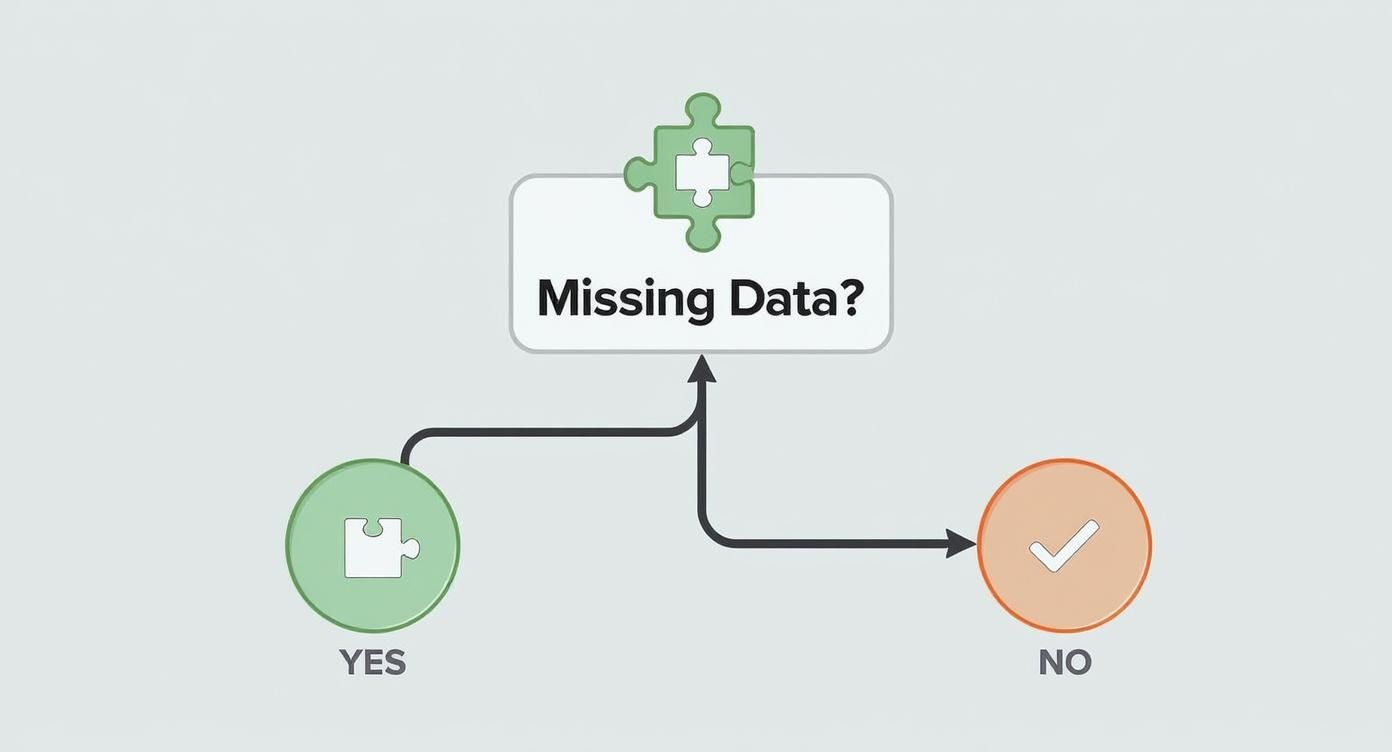
As the decision tree illustrates, addressing foundational issues like missing data is a prerequisite before you can move on to more advanced analytical methods.
Moving From Clues to Conclusions with Inferential Statistics
Once you’ve explored the data and have a few hypotheses brewing, it’s time to bring out the bigger tools. This is where inferential statistics come into play. If EDA is about finding clues, inferential statistics is about building a case and proving it beyond a reasonable doubt. These methods let you make inferences or predictions about a larger population based on a smaller sample of your data.
Let's break down some of the most common statistical tests without the scary jargon. Imagine we're analyzing customer feedback to see if a recent website redesign improved user satisfaction scores (rated 1-5).
The core idea behind inferential statistics isn't just to describe your sample data, but to use that sample to make an educated guess about everyone. It’s about moving from "what happened" to "what will likely happen."
Understanding which test to use is the key. Here’s a quick guide to some of the heavy hitters.
Common Statistical Tests and When to Use Them
Deciding on the right statistical test can be daunting, but it really boils down to what your research question is and what kind of data you're working with. This table breaks down some of the most common tests and gives you a clear idea of when to use each one.
Choosing the right method depends entirely on your research question and your data types (categorical vs. numerical). This isn't just an academic exercise; using the wrong test can lead to completely flawed conclusions. And let’s be honest, nobody wants to be the person who confidently presents bad data.
This whole process—from initial exploration to rigorous testing—is what separates guessing from genuine data-driven discovery. And while these methods might seem complex, modern tools are making them far more accessible. Platforms like integrate data analysis features right into your workspace, so you can manage your research and run analyses without needing to be a statistical wizard. By simplifying the workflow, you can focus more on asking better questions and interpreting the results—which is where the real value lies.
How AI Fits Into Your Data Analysis Workflow
Let's be honest: manually digging through thousands of data points isn't just a headache; it's an outdated way of working. The future of data analysis is already here, and it’s powered by Artificial Intelligence. This isn't about letting bots take over your job. It's about using smarter tools to get better, faster answers.
AI is completely changing how we approach analysis by automating complex tasks that once demanded niche expertise. It can chew through enormous amounts of information, spot patterns you'd never see, and make predictions in ways a human analyst simply can't. Think of it as having a brilliant, tireless assistant who can see connections you might easily miss.
Automating the Tedious Work of Analysis
One of the most immediate wins with AI is its knack for handling the drudgery of qualitative data. Imagine you’re facing hundreds of open-ended survey responses. Manually reading, coding, and categorizing all that text could take days. AI, specifically through Natural Language Processing (NLP), can knock out that thematic analysis in minutes.
For example, an NLP algorithm can scan all your customer feedback and instantly group comments into themes like "pricing concerns," "positive user experience," or "feature requests." This doesn't just save an incredible amount of time; it also removes a layer of human bias from the initial sorting process.
This move toward automation isn't a small trend. By 2025, nearly 65% of organizations are expected to be using or actively exploring AI-driven techniques for their data analysis. It's a huge part of why the global data analytics market is projected to hit $132.9 billion by 2026, a clear sign of the massive demand for more advanced tools. You can read more about .
Finding Patterns Humans Might Miss
Beyond just doing the grunt work, AI is exceptionally good at finding subtle patterns buried in complex data. A human analyst might spot a simple correlation between two variables, but an AI model can juggle dozens of variables at once to uncover intricate, non-obvious relationships. This is where you find a real competitive edge.
Picture a retail business looking at its sales data. An AI model could uncover that a specific product sells best on rainy Tuesdays, but only when bought alongside a particular complementary item. It's highly unlikely a person would even think to test for such a specific combination of factors.
AI doesn't replace the researcher; it empowers them. By handling the heavy lifting of computation and pattern recognition, it frees you up to focus on the strategic part of the work—interpreting the findings and deciding what to do next.
This is the exact philosophy we built into platforms like Zemith. You shouldn't need a Ph.D. in computer science to benefit from sophisticated algorithms. Our platform has integrated tools that let you analyze documents, identify key themes, and explore data without writing a single line of code. It’s a smarter way to work, letting you ask bigger questions and find better answers.
From Predictive Models to Actionable Insights
One of the most powerful applications of AI is predictive modeling. These models analyze historical data to forecast future trends with a surprising level of accuracy. Businesses can use this to get ahead of customer churn, forecast demand for a new product, or spot potential market shifts before they happen.
Here’s a look at how AI can be put to work in different research scenarios:
- Sentiment Analysis: Automatically gauge the emotional tone (positive, negative, neutral) of customer reviews, social media chatter, or support tickets.
- Predictive Analytics: Forecast future outcomes based on past data, like figuring out which sales leads are most likely to close.
- Anomaly Detection: Pinpoint unusual data points that don't fit the norm, which could be a signal for fraud, system errors, or even a new emerging trend.
These methods are becoming more and more accessible. If you’re looking for the right software to get started, you might find our guide on helpful in narrowing down the options for your project. By bringing these smart technologies into your workflow, you can stop just analyzing what happened and start actively predicting what will happen next.
Turning Data into a Compelling Story

You’ve wrestled with the data, scrubbed it clean, and run your tests. Great! You found something interesting. But now what? A brilliant insight buried in a spreadsheet is like a punchline to a joke you forgot to tell—completely useless. This final phase is where your analysis truly comes to life.
Your real goal now is to transform raw numbers and statistical outputs into a story people can understand, remember, and act on. It’s all about connecting the dots between your findings and what they actually mean in the real world. This is what separates a dry, academic report from a powerful narrative that drives decisions.
From Raw Numbers to Meaningful Interpretation
Interpretation is more art than science. It's that moment when you step back from the statistical weeds and ask, "So what?" What does a p-value of 0.03 actually mean for our marketing strategy? What story is that upward trend in customer engagement telling us about our latest product update?
One of the oldest traps in the book is confusing correlation with causation. Just because two things happen at the same time doesn't mean one caused the other. For instance, you might find a strong correlation between ice cream sales and shark attacks. Does that mean ice cream causes shark attacks? Of course not. The real culprit (the "lurking variable") is summer weather, which drives up both. Never be the person who suggests banning ice cream to improve beach safety.
Interpretation isn’t just about stating your results; it’s about explaining them. Your job is to be the translator who converts the language of data into the language of business, strategy, and human impact.
This is where having an organized workspace pays off big time. When you can see your raw data, analysis, and notes all in one view, building a coherent narrative becomes much easier. A platform like Zemith can be a huge help here by keeping your entire project—from documents to datasets—in a unified library, making it simpler to connect the dots without losing the thread of your story.
Visualizing Your Findings for Maximum Impact
A good chart is worth a thousand data points, but a bad one just creates a thousand questions. Data visualization is your most powerful storytelling tool. The human brain processes visual information 60,000 times faster than text, so a well-designed graph can make your key findings hit home instantly.
The trick is choosing the right visualization for the job. Not all charts are created equal, and picking the wrong one can muddy your message or, even worse, mislead your audience. You have to match the chart type to the story you’re trying to tell.
Here are a few of my go-to choices and what they’re best for:
- Bar Charts: Perfect for comparing distinct categories. Think sales figures across different regions or the number of survey respondents in various age groups.
- Line Charts: The classic choice for showing trends over time. Use these to track website traffic month-over-month or show how a key metric changed after a new feature launch.
- Scatter Plots: Essential for showing the relationship between two numerical variables. This is how you'd visually explore the connection between ad spend and revenue.
- Heatmaps: Fantastic for making sense of complex tables, like user activity on different days and times. The colors make it easy to spot hotspots at a glance.
Creating visuals that are clear and compelling is a crucial skill. For a deeper dive, check out our guide on , which is packed with practical tips for designing charts that are both beautiful and insightful.
Building Your Data-Driven Narrative
Okay, it's time to pull it all together. Your story needs a clear beginning, middle, and end.
Start with the business problem or question you set out to answer. Then, walk your audience through your key findings, using your powerful visuals to illustrate your points. And finally, conclude with the "so what"—the concrete, actionable recommendations that logically follow from your analysis.
Remember, your audience probably doesn't care about the nitty-gritty of your statistical methods. They care about what the results mean for them. So, ditch the jargon, focus on the story, and let your data do the talking.
Common Questions About Analyzing Research Data
So, you've made it through the entire data analysis journey—from wrestling with messy spreadsheets to figuring out how to tell a compelling story with your findings. But even with a solid plan, a few questions always seem to surface right when you're in the thick of it.
Let's tackle some of the most common queries that come up. These are the practical, "okay, but what about..." questions that pop up when theory meets the real world.
What’s the Best Software for Data Analysis?
This is the million-dollar question, isn't it? The honest answer is that the "best" tool really depends on what you need, what your budget looks like, and how comfortable you are with technical software. There’s no single right answer, but here’s how I think about it:
- For Beginners: Don't underestimate tools like or . They're surprisingly robust for basic analysis, great for simple descriptive stats, and perfect for getting your feet wet without a steep learning curve.
- For Statisticians and Coders: If you're comfortable writing code, then languages like and (with its libraries like Pandas and Matplotlib) are the gold standard. They give you incredible power and flexibility for complex statistical modeling and machine learning.
- For All-in-One Productivity: This is where platforms like Zemith really shine. They go beyond just running tests by integrating your entire research workflow. You can manage documents, clean data, and use AI-powered tools to spot themes all in one place. It’s ideal for researchers who need to stay organized without juggling a dozen different apps.
The best tool is simply the one that fits your project. Never feel pressured to use a complex program when a simpler one will get the job done just as well.
How Much Data Do I Actually Need?
Another classic question with a classic "it depends" answer. The amount of data you need—your sample size—hinges on a few key things: how complex your research question is, the statistical power you need to confidently detect an effect, and how much variability exists within the population you're studying.
For example, a simple A/B test on a website headline might only require a few hundred visitors to get a clear winner. On the other hand, a detailed medical study trying to isolate a subtle effect could require thousands of participants. If you gather too little data, your results might not be statistically significant. But if you gather too much, you’ve just wasted valuable time and resources.
The goal isn’t just to get "a lot" of data; it's to get enough of the right data to answer your question with confidence. Quality and relevance always trump sheer quantity.
How Do I Handle Biased or Unethical Data?
This is a critically important question, especially as AI becomes more involved in analysis. If your source data is biased—say, a survey that only samples one demographic—then your results will be biased, no matter how sophisticated your analysis is.
Ethical considerations are non-negotiable. This means protecting participant privacy, using data responsibly, and being transparent about your methods. The recent 2025 AI Index Report highlighted that U.S. institutions produced 40 notable AI models in 2024, leading the world. This explosion in AI development has rightly put a spotlight on Responsible AI frameworks, which directly influence how we ethically handle the massive volumes of research data these models generate. You can in the full report.
Here are a few ways to approach these challenges:
- Acknowledge Bias: Be aware of potential biases in your data collection from the start, and openly discuss these limitations in your final report.
- Anonymize Data: Before you even begin your analysis, make sure you remove all personally identifiable information (PII).
- Fairness Audits: When using AI models, it's a good practice to run audits to check for algorithmic bias that might disadvantage certain groups.
Knowing how to analyze data is only half the battle. Doing it responsibly is what gives your findings real credibility and impact.
Ready to stop juggling multiple tools and bring your entire research workflow into one smart, organized space? Zemith is the all-in-one AI platform that combines document management, data analysis, and creative tools to supercharge your productivity. Ditch the chaos and discover a better way to work.
Explore Zemith Features
Every top AI. One subscription.
ChatGPT, Claude, Gemini, DeepSeek, Grok & 25+ more


Always on, real-time AI.
Voice + screen share · instant answers
What's the best way to learn a new language?
Immersion and spaced repetition work best. Try consuming media in your target language daily.
Voice + screen share · AI answers in real time
Image Generation
Flux, Nano Banana, Ideogram, Recraft + more

Write at the speed of thought.
AI autocomplete, rewrite & expand on command
Any document. Any format.
PDF, URL, or YouTube → chat, quiz, podcast & more
Video Creation
Veo, Kling, Grok Imagine and more

Text to Speech
Natural AI voices, 30+ languages
Code Generation
Write, debug & explain code
Chat with Documents
Upload PDFs, analyze content
Your AI, in your pocket.
Full access on iOS & Android · synced everywhere
Your infinite AI canvas.
Chat, image, video & motion tools — side by side
Save hours of work and research
Transparent, High-Value Pricing
Trusted by teams at
Free
No credit card required
- 100 credits daily
- 3 AI models to try
- Basic AI chat
Plus
- 1,000,000 credits/month
- 25+ AI models — GPT, Claude, Gemini, Grok & more
- Agent Mode with web search, computer tools and more
- Creative Studio: image generation and video generation
- Project Library: chat with document, website and youtube, podcast generation, flashcards, reports and more
- Workflow Studio and FocusOS
Professional
- Everything in Plus, and:
- 2,100,000 credits/month
- Pro-exclusive models (Claude Opus, Grok 4, Sonar Pro)
- Motion Tools & Max Mode
- First access to latest features
- Access to additional offers
What Our Users Say
Great Tool after 2 months usage
"I love the way multiple tools they integrated in one platform. Going in the right direction."
— simplyzubair
Best in Kind!
"The quality of data and sheer speed of responses is outstanding. I use this app every day."
— barefootmedicine
Simply awesome
"The credit system is fair, models are perfect, and the discord is very responsive. Quite awesome."
— MarianZ
Great for Document Analysis
"Just works. Simple to use and great for working with documents. Money well spent."
— yerch82
Great AI site with accessible LLMs
"The organization of features is better than all the other sites — even better than ChatGPT."
— sumore
Excellent Tool
"It lives up to the all-in-one claim. All the necessary functions with a well-designed, easy UI."
— AlphaLeaf
Well-rounded platform with solid LLMs
"The team clearly puts their heart and soul into this platform. Really solid extra functionality."
— SlothMachine
Best AI tool I've ever used
"Updates made almost daily, feedback is incredibly fast. Just look at the changelogs — consistency."
— reu0691