Your Ultimate Guide to Creating a Historical Mind Map in 2026
Tired of boring history lessons? Learn how to create a historical mind map to visualize connections, understand context, and make learning fun with AI tools.
Let’s be honest, trying to make sense of history by reading endless pages of dense text is a surefire way to have your eyes glaze over. Dynastic successions, treaty dates, and long lists of names can all start to blur together into a historical smoothie of boredom. A historical mind map is how you break free from that, turning flat, linear information into a dynamic, visual story that actually sticks.
Think of it as your own personal detective's board for the past. Except, you know, with fewer grainy photos and more "Aha!" moments.
Stop Reading History and Start Seeing It

Instead of just memorizing names and dates in a straight line, a mind map lets you see the web of connections. You start asking the interesting questions. How did a single invention in Europe create ripples that changed trade across the globe? How did a series of seemingly minor political spats snowball into a world war? That's what a good mind map helps you uncover.
This isn't just about making history look a little prettier, though that’s a definite perk. It's about truly understanding it on a much deeper level. You stop being a passive consumer of facts and start organizing them in a way that reveals the hidden patterns and relationships.
Why This Visual Method Works So Well
This approach is incredibly effective for anyone trying to get a handle on the past because it engages your brain differently than just reading. You're not just creating a list of events; you're building a landscape of insightful connections.
- For students, it’s a game-changing study tool. Instead of cramming text, you build a visual guide that makes complex topics like the Reformation or the Cold War much easier to review before an exam. Seriously, it's like a cheat code for finals week.
- For history buffs, you can finally tie together all those fascinating details from podcasts and documentaries into one big picture, tracing themes like technology or trade across centuries. It answers the question, "how does a historical mind map organize complex timelines?"
- For creators and writers, it’s the perfect way to brainstorm a historical novel, outline a YouTube documentary, or even build a D&D campaign setting, making sure your world feels authentic and interconnected.
The real power of a historical mind map is how it completely shifts your perspective. You move from being a passive reader to an active investigator, piecing together clues and seeing the grand narrative unfold for yourself.
To truly 'see' history, you might even want to bring old physical records into your digital workspace. Learning how to can help you integrate family archives or obscure historical images directly into your map. By embracing these , you turn tedious timelines into something you can actually explore. It's time to see history, not just read it.
The Ancient Art of Visualizing Knowledge
When you sit down to create a historical mind map, you might think you're just using a modern productivity trick. But the truth is, you’re actually part of a tradition that’s nearly two millennia old. You're walking in the footsteps of some of history's greatest thinkers.
This isn't some new-fangled study method. The whole idea of visually organizing knowledge goes way, way back—all the way to the 3rd century AD, in fact. That’s when the philosopher Porphyry of Tyros, from what is now Lebanon, created what we’d now recognize as the first mind maps.
He used tree-like diagrams to unpack the dense philosophical categories of Aristotle. Think about that. Almost 2,000 years ago, he was turning complex text into clear, simple visuals.
From Ancient Trees To Genius Notebooks
The idea didn't stop with Porphyry. Centuries later, others ran with it.
In the 13th century, the mystic Ramon Llull came up with his ‘Llullian wheels.’ These were these incredible, rotating paper discs that basically worked like an analog computer. He used them to explore theological concepts and generate new combinations of ideas—a very early, and very cool, form of brainstorming.
And of course, you can't talk about brilliant visual thinking without bringing up Leonardo da Vinci. His personal notebooks are an absolute masterclass in connecting ideas. They’re a whirlwind of sketches, notes, and diagrams that weave together art, science, and engineering. He wasn't just taking notes; he was thinking on paper.
By creating a historical mind map, you're not just organizing facts. You're participating in a long lineage of genius-level thinking, using a method proven to deepen understanding and reveal hidden connections.
These innovators were all onto a fundamental truth: our brains are wired for visual information. Modern science proves them right. Studies show that people who use mind maps can improve their information retention by 10-15% compared to those who just take linear notes.
Even more impressive? One study found that after six weeks, mind mappers scored a whopping 32% higher on recall tests. If you want to geek out on the data, check out the research on .
This long history shows us that visualizing knowledge is far more than a quirky study habit. It’s a powerful and time-tested method for wrestling with big, complicated ideas.
For a great primer on the core concepts, read our guide on . You'll see that when you start your next mind map, you're joining a club that includes some of the most creative minds in history.
Step 1: Choose Your Narrative Structure
Alright, let's get into the nitty-gritty of building your historical mind map. Before you start dropping nodes and connecting lines, you need a plan. The very first decision you'll make—and it's a big one—is choosing the kind of story you want to tell.
Are you tracing events as they happened, moment by moment? Or are you exploring a single big idea as it weaves its way through different eras? This boils down to two core approaches: a timeline map or a thematic map.
The Classic Storyteller: The Timeline Map
Think of a timeline map as the most straightforward way to tell a historical story. It's linear, it's chronological, and it’s all about cause and effect. This structure is your best friend when the sequence of events is the whole point.
For instance, if you’re mapping the lead-up to the American Revolution, you’d start with early colonial grievances and then draw a direct line through every tax, protest, and skirmish that pushed things toward 1776. It’s all about the what happened next.
A timeline map is perfect for:
- Biographies: Laying out the major milestones in the life of someone like Marie Curie.
- Conflicts: Showing the entire arc of the Space Race, from the shock of Sputnik to the triumph of the Moon landing.
- Political Histories: Tracing the rise and fall of the Roman Empire, emperor by emperor, battle by battle.
The Deep Dive: The Thematic Map
A thematic map, on the other hand, isn't bound by time. Instead, you put a central concept, idea, or theme right in the middle and branch out to explore how it shows up across different periods. It's less about a linear story and more about making surprising connections.
You could, for example, build a map around the "evolution of maritime trade." Your central topic would connect nodes representing ancient Phoenician sailors, Roman galleys, the Spanish Armada, and even today's massive container ships. The goal is to see the patterns, not just the progression.
A thematic map shines when you want to:
- Track an Idea: Exploring a concept like "democracy" from its roots in Ancient Athens all the way to modern movements.
- Compare and Contrast: Analyzing the "impact of pandemics" by connecting the Black Death, the 1918 flu, and COVID-19.
- Follow an Influence: Mapping how a specific art style or technology spread across the globe and changed over time.
Timeline Map vs. Thematic Map: Which Is Right for You?
So, how do you pick? It really comes down to your end goal. The table below gives you a quick-glance comparison to help you decide which structure fits your project best.
Ultimately, neither style is inherently "better"—it's all about what helps you organize your thoughts and tell the most compelling story.
The best way I've found to decide is to ask yourself one simple question: "Am I telling a story about when things happened, or a story about why a certain idea matters?" Your answer will almost always point you to the right structure.
Your choice here really sets the stage for your entire project. A timeline provides a clear, logical path forward, while a thematic map encourages a more exploratory, creative process where you can uncover unexpected links between different parts of history.
If you’re curious about other ways to visualize information, exploring different can give you even more ideas. And don't worry about getting it perfect on the first try. The beauty of a digital tool like Zemith's Whiteboard is that there’s no penalty for starting over. No eraser smudges, no wasted paper—just a clean slate whenever you need one.
Step 2: Build and Research Your Map with Zemith
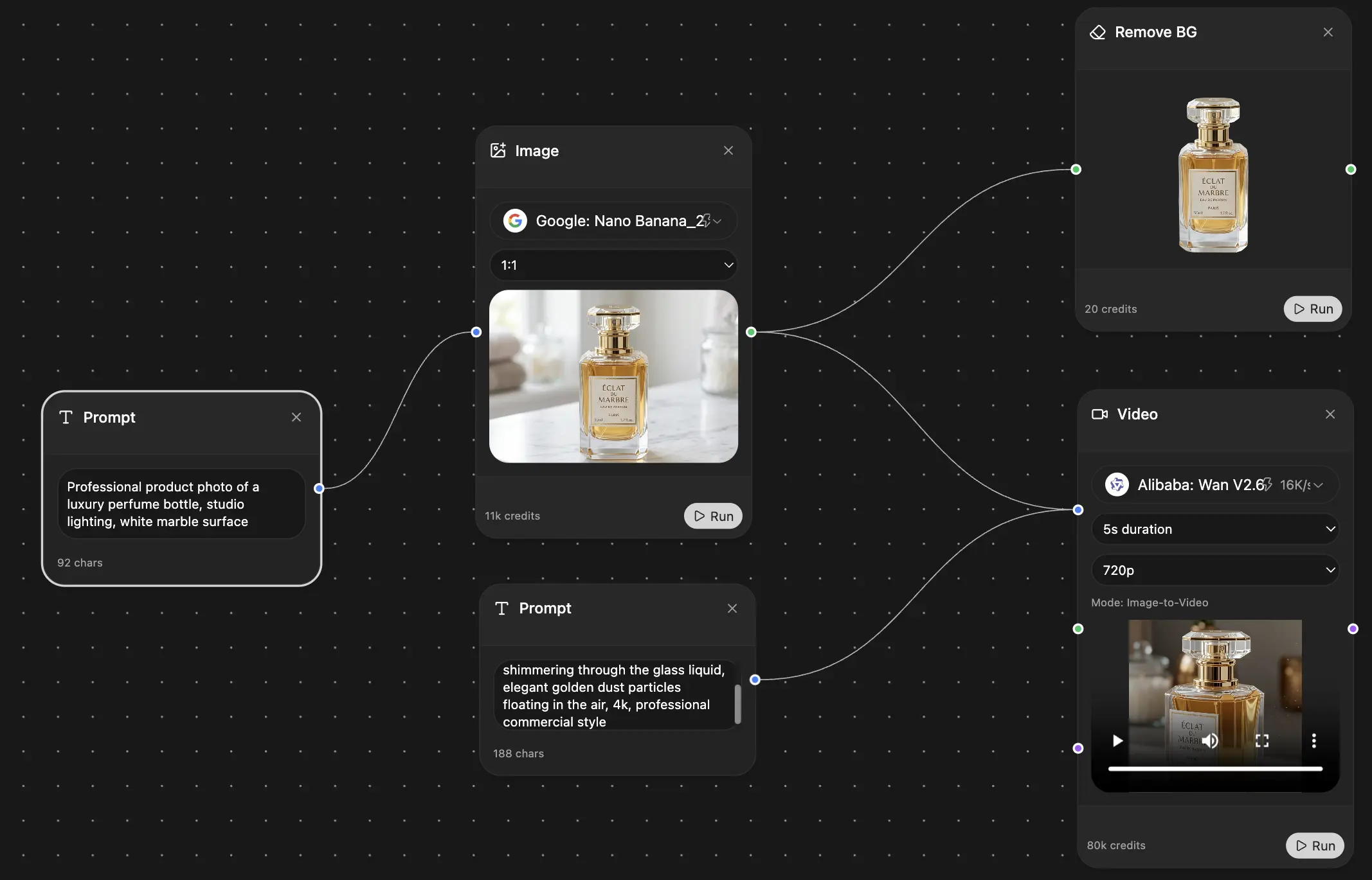
Alright, theory is great, but let's talk about how this actually works in practice. I'm going to walk you through how I build these maps using Zemith, because its tools are practically built for this kind of creative, research-heavy work. You'll see how a few integrated features can help you spin a single idea into a rich, visual narrative.
The first thing I do is open a fresh Zemith Whiteboard. This is your command center. Don't overthink it; just plant your core topic right in the middle. For this walkthrough, let's use 'The Silk Road.' A single node with that label is all you need to get the ball rolling.
From that central idea, start branching out based on the structure you decided on earlier—timeline or thematic. If we're going thematic with 'The Silk Road,' I'd probably start with big-picture branches like "Goods Traded," "Key Cities," "Cultural Exchange," and "Famous Travelers."
Using AI to Fuel Your Research
Now comes the part where the map starts to get interesting: filling it with actual information. You don’t need to be an expert on day one. This is where you can lean on Zemith's AI tools to do the heavy lifting.
If you need quick facts, the Deep Research tool is your best friend. I use it for targeted questions like, "What were the main goods traded eastward on the Silk Road?" or "Summarize the historical significance of Samarkand." It pulls information from solid sources, giving you the raw material to flesh out your map.
Ever find a monster of an academic paper or a super long article? Instead of blocking out an hour to read it, just drop it into the Document Assistant. In seconds, it can spit out a summary, pinpoint key stats, or even break down a dense argument into plain English. It’s like having a research assistant who reads at lightning speed.
Making Your Map Visual and Memorable
A good historical mind map shouldn't just be a wall of text. It needs to be visually engaging. As you find vintage maps, paintings of caravans, or photos of artifacts, drag and drop them right onto your Whiteboard next to the relevant nodes.
You can even get creative with Zemith’s Image Generation to make custom icons. Think about a small, stylized camel icon for your "Goods Traded" branch or a pagoda for "Cultural Exchange." These little visual cues go a long way in making your map easy to scan and remember.
As you work, your mind (and probably your desk) will fill up with random thoughts, quotes, and half-baked ideas. That's what the Smart Notepad is for. It's your digital scratchpad. Just dump everything in there. The AI features can then help you sort through the chaos and turn those messy notes into clean descriptions for your mind map. This is honestly one of the biggest perks of using an for a project like this.
This flow chart gives a good overview of how the process works, whether you're building a timeline or a thematic map.

The main takeaway here is that while your final map might look different depending on the structure, the core process—research, organization, and visualization—stays the same.
Pro Tip: Don't try to build the whole map in one go. You'll burn out. Pick one main branch and go deep. Completely flesh out "Key Cities" before you even start thinking about "Famous Travelers." This keeps the process manageable and ensures every section is as detailed as it can be.
Finally, pull everything into a Zemith Project. This acts as a container for your entire topic, creating a single, shareable source of truth. Your Whiteboard, your research docs, your notes—it all lives together in one tidy spot. You’ve successfully turned a simple starting point into a dynamic historical resource. And while Zemith is a fantastic all-in-one option, it's also smart to see what else is out there. Tools like offer different features that might give you a new perspective on how to structure your historical insights.
Learning from a Masterpiece of Visual Storytelling
A great historical mind map isn't just a jumble of facts—it tells a story. And if you want to see what that looks like in action, you have to check out Charles Joseph Minard’s legendary 1869 map of Napoleon's disastrous Russian campaign. This isn't just a map; it's a visual gut-punch.
When data visualization experts like Edward Tufte call it 'the best statistical graphic ever drawn,' they’re not exaggerating. Minard somehow managed to pack an entire, heart-wrenching narrative into one single image. He shows us exactly how a story of failure can be far more powerful than any chapter in a history book.
Decoding Minard’s Genius
So what makes Minard’s map so brilliant? It’s his ability to layer multiple types of information together without making a cluttered mess. He brilliantly wove six different variables into one single, coherent graphic:
- Army Size: Shown by the thickness of the main band.
- Location: The band literally follows the army's path across the continent.
- Direction: One color for the advance, a different one for the retreat.
- Key Dates: Marked along the route.
- Temperature: Plotted on a separate graph at the bottom, directly linked to the retreat path.
- Specific Locations: Rivers and cities are labeled to keep you oriented.
You can physically see Napoleon's Grand Armée of 422,000 soldiers wither away. The tan band representing the advance slowly shrinks, and then the black band of the retreat thins to a terrifyingly fine line.
The map tells a devastating story. It shows the army dwindling to a mere 10,000 men—a staggering 97.6% mortality rate—as temperatures plunged to a bone-chilling -30°C. We now know that visuals like this can improve comprehension by up to 40% over just reading a table of numbers. If you want to dive deeper, Big Think has a great analysis of .
Actionable Lessons for Your Zemith Mind Map
Okay, so what can we steal from Minard for our own projects? The core principles are surprisingly simple to apply, especially when you’re using a flexible tool like Zemith's Whiteboard.
Use Visuals to Show, Not Just Tell Instead of just writing a note that says "the army got smaller," Minard showed it by thinning the line. You can do the same thing in Zemith. Make the lines connecting your nodes thicker for more important relationships, or use larger nodes for foundational events. Show the hierarchy of ideas visually.
Color Tells a Story Minard used a dead-simple two-color scheme (tan for advance, black for retreat) to instantly signal success versus failure. Use color in your map to create a visual language. For example, maybe all economic factors are blue, military events are red, and cultural shifts are green. Your brain will start making connections before you even read the text.
Integrate Data Gracefully The temperature chart at the bottom of the map isn't just a random add-on; it's directly tied to the army's location during the retreat, explaining why the black line gets so thin. When you use Zemith's Document Assistant to pull in statistics, don't just dump them into a text box. Figure out a way to represent them visually—maybe by using different-sized icons or by placing them on the map to show their direct impact.
You don't need to be a 19th-century French engineer to make an impact. By taking these lessons to heart, your historical mind map can go from being a collection of facts to a compelling visual story that actually hits home.
Step 3: Find the Hidden Connections in History

Want to see what this looks like on a massive scale? A project called 'Charting Culture' mapped the birth and death locations of 400,000 notable figures from 600 BC all the way to 2012. The result is a stunning visualization of intellectual hotspots rising and falling over centuries. They found that 75% of these cultural hubs aligned with spikes in the births and deaths of influential people, visually proving a concept we usually just read about. You can see some of the incredible maps and animations of .
Uncovering Strange Overlaps
The real magic happens when you find those bizarre overlaps that completely shatter our neat, chapter-by-chapter view of the past.
Think about this for a second: Michelangelo was still alive and painting for nearly 30 years after Queen Elizabeth I took the throne. Or that Nikola Tesla and a very young Joe Biden were contemporaries. These aren't just fun trivia—they're breadcrumbs. They hint at a past that was just as messy, overlapping, and interconnected as our world is today.
Your mind map is the perfect tool for hunting down these breadcrumbs. Here are a few ways to start looking:
- Layer your timelines. What was happening in science in the Ming Dynasty while the European Renaissance was in full swing? Put two timelines side-by-side and see who was active in different corners of the world at the exact same moment.
- Map out influence networks. Go way beyond simple family trees. Who was funding whom? Who was writing letters to whom? Who mentored whom? A Zemith Whiteboard is perfect for building out these webs of influence.
- Draw lines from ideas to events. How, specifically, did Enlightenment philosophy shape the language in the Declaration of Independence? A mind map lets you draw a literal line connecting an abstract concept to a concrete primary source.
The goal isn't just to gather data, but to question it. When you find a surprising connection, that's your cue to dig deeper. That’s the moment your mind map becomes a real tool for historical investigation.
As you start spotting these potential links, you can use Zemith's AI tools to chase them down. When a connection seems too odd to be true, fire up Deep Research to instantly find supporting evidence or conflicting reports.
This process of validating what you find is crucial. For some extra guidance, check out our guide on . This is how you move from simply reading history to actively uncovering the hidden web that shaped our world.
A Few Lingering Questions Answered
Still have a couple of questions rattling around in your head? It’s completely normal. Let’s tackle some of the most common ones we hear from people diving into historical mind mapping for the first time.
Just How Big Can These Things Get?
Honestly? As big as you need them to be. Don't be afraid to go deep.
You can start small with a single historical figure and then branch out, or you can go for it and try to map the entire rise and fall of the Roman Empire. The beauty of a tool like is that it’s built to handle a massive amount of information without becoming a chaotic mess.
Paper or Digital? What's the Real Verdict?
Look, I love the feel of pen on paper for a quick brainstorm. But for a serious historical project, digital is the only way to go.
Think about it: you can easily drop in links to your sources, embed research summaries you’ve made with Zemith's Document Assistant, and drag and drop entire branches when you change your mind. It’s flexible in a way paper just can’t be.
Plus, you can’t accidentally spill an entire latte on a cloud-based project. Trust me, it's a lesson you only want to learn once.
Is This Just a History Thing?
Not at all! While it's perfect for untangling timelines and historical connections, this method is a powerhouse for just about anything.
I've seen people use it to map out complex literary themes for a thesis, chart out scientific discoveries, or even build an entire world for their D&D campaign. The core principles—visualizing connections and organizing ideas—are universal.
Ready to stop just reading about the past and actually see how it all connects? Zemith has all the AI-powered tools you'll need, from the whiteboard to document analysis, to help you create your most insightful historical mind map yet. Go ahead and explore what's possible at .
Explore Zemith Features
Every top AI. One subscription.
ChatGPT, Claude, Gemini, DeepSeek, Grok & 25+ more


Always on, real-time AI.
Voice + screen share · instant answers
What's the best way to learn a new language?
Immersion and spaced repetition work best. Try consuming media in your target language daily.
Voice + screen share · AI answers in real time
Image Generation
Flux, Nano Banana, Ideogram, Recraft + more

Write at the speed of thought.
AI autocomplete, rewrite & expand on command
Any document. Any format.
PDF, URL, or YouTube → chat, quiz, podcast & more
Video Creation
Veo, Kling, Grok Imagine and more

Text to Speech
Natural AI voices, 30+ languages
Code Generation
Write, debug & explain code
Chat with Documents
Upload PDFs, analyze content
Your AI, in your pocket.
Full access on iOS & Android · synced everywhere
Your infinite AI canvas.
Chat, image, video & motion tools — side by side
Save hours of work and research
Transparent, High-Value Pricing
Trusted by teams at
Free
No credit card required
- 100 credits daily
- 3 AI models to try
- Basic AI chat
Plus
- 1,000,000 credits/month
- 25+ AI models — GPT, Claude, Gemini, Grok & more
- Agent Mode with web search, computer tools and more
- Creative Studio: image generation and video generation
- Project Library: chat with document, website and youtube, podcast generation, flashcards, reports and more
- Workflow Studio and FocusOS
Professional
- Everything in Plus, and:
- 2,100,000 credits/month
- Pro-exclusive models (Claude Opus, Grok 4, Sonar Pro)
- Motion Tools & Max Mode
- First access to latest features
- Access to additional offers
What Our Users Say
Great Tool after 2 months usage
"I love the way multiple tools they integrated in one platform. Going in the right direction."
— simplyzubair
Best in Kind!
"The quality of data and sheer speed of responses is outstanding. I use this app every day."
— barefootmedicine
Simply awesome
"The credit system is fair, models are perfect, and the discord is very responsive. Quite awesome."
— MarianZ
Great for Document Analysis
"Just works. Simple to use and great for working with documents. Money well spent."
— yerch82
Great AI site with accessible LLMs
"The organization of features is better than all the other sites — even better than ChatGPT."
— sumore
Excellent Tool
"It lives up to the all-in-one claim. All the necessary functions with a well-designed, easy UI."
— AlphaLeaf
Well-rounded platform with solid LLMs
"The team clearly puts their heart and soul into this platform. Really solid extra functionality."
— SlothMachine
Best AI tool I've ever used
"Updates made almost daily, feedback is incredibly fast. Just look at the changelogs — consistency."
— reu0691