A Guide to Data Analysis and Report Writing: From Messy Data to Clear Insights
Tired of confusing data? Our guide to data analysis and report creation shows you how to turn raw numbers into clear, actionable insights your team will love.
Data analysis isn't just about crunching numbers; it's the art of turning raw, chaotic data into a story that drives real-world decisions. It’s the entire process—inspecting, cleaning, modeling, and then presenting what you've found in a way that actually makes sense to people. You’re aiming to deliver actionable insights, not just a spreadsheet full of figures that puts everyone to sleep.
Start With The Right Questions, Not The Right Data
We’ve all been there. A colleague drops a request: "Let's look at the sales data." Before you know it, you're drowning in spreadsheets and pivot tables, clicking around without a clear purpose. The problem isn't the data itself. It's that no one stopped to figure out what we were trying to solve in the first place.
Any good data project starts long before you open a single CSV file.
Jumping straight into the data without a clear goal is like starting a road trip with no destination in mind. You’ll burn through gas (and sanity), and you probably won't end up anywhere meaningful. The trick is to formulate sharp, specific questions that will guide you through the entire analysis. They become your North Star.
Define Your Objectives and KPIs
Before you touch a single cell, you have to know what success looks like. Are you trying to pinpoint why customer churn spiked by 15% last quarter? Or maybe you need to figure out which marketing channels are actually delivering high-value leads. Vague goals only ever produce vague, unhelpful results.
Get specific by asking a few pointed questions upfront:
- What exact decision will this report help someone make?
- Which key performance indicators (KPIs) genuinely measure success for this particular goal?
- Who is this report for, and what do they really need to know? (Hint: The CEO and the marketing intern probably need different reports).
I once spent weeks on a deep dive into website traffic patterns, creating what I thought were brilliant charts. I presented it to the leadership team, who stared back blankly. Their only concern was lead quality, not traffic volume. The report was a total flop because we answered a question nobody was asking. It was a tough lesson, but it taught me everything about knowing your audience.
To avoid that mistake, it helps to map out your strategy from the get-go.
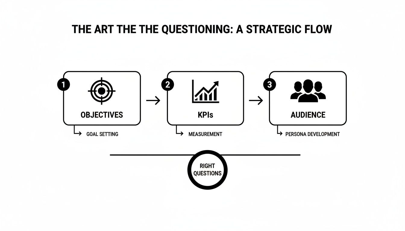
Following a flow like this ensures every piece of your analysis is directly linked to a business outcome and built for the people who will use it.
Collaborate Before You Calculate
This whole questioning phase is a team sport, not a solo mission. Talk to your stakeholders. The folks in marketing, sales, and product have on-the-ground context you’ll never find in a database. Getting aligned from the very beginning saves a ton of rework and frustration later on.
This is where a tool like Zemith's Whiteboard really shines. You can get everyone in a shared virtual space to brainstorm questions, map out KPIs, and agree on the audience. It’s all about creating alignment before a single data point gets pulled. No more building reports in a vacuum only to find out you solved the wrong problem.
This groundwork is absolutely essential for making smart business choices. If you want to dig deeper into this philosophy, check out our guide on . When you nail down the right questions first, you transform data analysis from a technical chore into a powerful strategic tool.
How To Clean Your Data Without Losing Your Mind
Alright, let's talk about data cleaning. You've probably heard the old saying: data science is 80% cleaning data and 20% complaining about cleaning data. Okay, maybe I added that last part. But seriously, this is the unglamorous, behind-the-scenes work that makes or breaks your entire analysis.
Think of it like this: you wouldn't build a house on a shaky foundation, right? Same thing here. If your data is a mess, your data analysis and report will be too, and nobody trusts a report built on bad data. Raw data is almost never ready to go. It's a jumble of different formats, missing pieces, and typos. Your first job is to bring some order to that chaos.
Common Data Headaches and How to Fix Them
After you've done this a few times, you start to see the same problems crop up again and again. You'll run into missing values, inconsistent text, and duplicate entries that mess with your counts.
Here are the usual suspects and how I typically handle them, especially if I'm working in Python with the Pandas library.
- Missing Values: It's tempting to just drop rows with empty cells using
df.dropna(), but be careful—you might be throwing away a ton of good information. A smarter move is often to fill them in. You could use the mean or median for numerical data, or even just a placeholder like 'Unknown' withdf.fillna(value). - Weird Formatting: This one’s a classic. Your 'Country' column has "USA," "United States," and "U.S." all for the same place. You have to get these standardized. A simple
df['Country'].replace(['US', 'U.S.'], 'United States', inplace=True)does the trick nicely. - Zapping Duplicates: Duplicate rows are sneaky. They can inflate your numbers and make trends look more significant than they really are. A quick
df.drop_duplicates(inplace=True)is usually all you need to make sure every record is unique.
This is where having a smart assistant comes in handy. For instance, Zemith's Document Assistant can quickly scan a messy spreadsheet for inconsistencies or convert raw data into clean Markdown without all the manual copy-pasting. It’s a huge time-saver.

Having tools like this in one place means you're not constantly jumping between different apps just to get your data into a usable state.
Speeding Up Your Cleaning Workflow
Let's be honest, writing cleaning scripts from scratch for every single project is a massive time-drain. You want to get to the interesting part—the analysis—not spend days just prepping the data. This is where automation becomes your best friend.
A clean, well-managed dataset is the foundation of any reliable analysis. Investing time here prevents you from making critical decisions based on flawed information.
I've found that tools like Zemith’s Coding Assistant can really speed things up. Instead of hunting through Stack Overflow for the right command, you can just tell it what you need— "write a Python script to remove outliers from my sales data"—and it generates the code for you. It turns a tedious, manual chore into a much faster, more interactive process.
If you want to dig deeper into organizing your data for the long haul, check out our guide on . It's full of strategies that go beyond just the initial cleanup.
Turning Numbers Into A Compelling Story
Alright, your data is squeaky clean and ready for its big debut. Now for the fun part: making it actually mean something to someone. A great data analysis and report isn't about dumping numbers on a page; it's about telling a story that people can follow and act on. This is where we go beyond the old "just use a bar chart" advice and get into the real craft of visualization.
Raw numbers are, let's be honest, pretty boring. But a well-designed chart? That can spark an "aha!" moment in seconds. Your goal is to guide your reader’s eye straight to the most important takeaway, turning a dense spreadsheet into a clear, convincing argument.

This isn't just a nice-to-have skill; it's a massive business advantage. The global data analytics market is absolutely exploding, projected to rocket past USD 302 billion by 2030. That number tells you one thing: companies everywhere are betting big on data to make smarter decisions, and presenting that data effectively is central to the entire process.
Choosing The Right Visual For The Job
Not all charts are created equal. Using the wrong one is like trying to explain a movie plot using only interpretive dance—it’s confusing and, frankly, a little awkward for everyone involved. The secret is to match the chart type to the specific story you need to tell.
Here are my go-to choices for a clear and effective data story:
- Showing a trend over time? A line chart is your best friend. It’s perfect for tracking things like monthly sales figures or website traffic over a quarter.
- Comparing values between categories? Bar charts are the undisputed champs here. Nothing beats them for comparing sales across different regions or product performance.
- Revealing a hidden relationship? Scatter plots are fantastic for showing how two variables interact. For instance, you can quickly see if higher ad spend actually correlates with more user sign-ups.
- Showing parts of a whole? Use a pie chart... almost never. I'm only half-kidding. They can work for a couple of simple categories, but I find bar charts are almost always clearer and easier to read.
If you're really looking to up your game, especially with financial data, digging into the can give you some powerful new ways to present complex information.
The best visualizations don't just present data; they provoke questions and drive conversation. If your chart makes someone in the room say, "Huh, that's interesting," you've won.
Go Beyond The Default Templates
Want your report to stand out in a sea of identical, boring corporate PowerPoints? It’s time to add a little personality. This is where you can get creative and give your work a professional polish that makes it memorable.
Instead of grabbing generic icons, why not create custom ones that fit your brand? With a tool like Zemith's Image Generation, you can create unique, on-brand graphics for your report in seconds. Just type "a simple icon representing customer growth" and watch the magic happen. It’s a small touch that shows you’ve gone the extra mile, making your final data analysis and report feel less like a default export and more like a carefully crafted, professional document.
Turning Data Into Decisions
You've done the hard work. Your data is clean, your charts are looking sharp, and everything is organized. So… what now?
A stunning chart showing a sales dip is just a pretty picture until you can explain why it happened and what to do about it. This is where the real magic happens—turning all those observations into game-changing actions.
The goal isn't to become a statistician overnight. It’s about picking the right tool for the job to connect your findings back to those original business questions we obsessed over earlier. This means pushing past the "what happened?" and getting to the "so what?" and, finally, the "now what?"

This is the moment you bridge the gap between just seeing a trend and confidently recommending a course of action.
Picking The Right Analysis Method
Let's not overcomplicate this. There are a handful of core analysis methods that will help you find the story hidden in your data. You don't need a Ph.D. to use them, just a clear objective.
For instance, descriptive stats (like mean, median, and mode) give you the basic lay of the land. But what if you need to know if your marketing spend is actually driving sales? That’s where something like regression analysis comes into play, helping you spot relationships between different variables.
Want to group your customers into distinct buying personas? Clustering analysis is perfect for finding those natural segments. The key is always to match the technique to your question.
This systematic approach isn't just for business data. It’s the same logic used when learning for investment decisions. It’s all about finding patterns that suggest a clear path forward. And if you're dealing with less structured info like customer feedback, exploring different can offer a whole new perspective.
The real value of an analysis isn’t the complexity of the model you used; it’s the clarity of the recommendation it produces. If your insight doesn’t lead to a clear "next step," it's not an insight—it's just an observation.
Not sure where to start? This table can help you pick the right method based on what you're trying to figure out.
Choosing The Right Analysis Method
Think of this as your quick-reference guide. Once you have your initial results, you can take things a step further.
Supercharge Your Conclusions With AI
Once you have your initial findings, it’s time to build a rock-solid case for them. This is where modern tools can give you a massive advantage.
Imagine you’ve found that customer churn is highest among a specific demographic. Instead of stopping there, you can instantly validate that finding against broader market trends.
This is exactly what you can do with a feature like Zemith's Deep Research. Just feed it your initial conclusion—"our churn is highest with customers in the 18-24 age group"—and ask it to find supporting market data, run a quick competitor analysis, or even pull up academic papers that back your theory. This transforms your conclusion from a hunch into an evidence-backed recommendation.
This approach is quickly becoming the new standard. With nearly 90% of organizations using AI regularly, these kinds of advanced tools are more accessible than ever, letting you get powerful insights without a massive research team.
Ultimately, a great data report doesn't just present facts; it builds a compelling argument for change. By combining sound analytical techniques with the power of AI, you can deliver insights that don't just get noticed—they get results.
Crafting A Final Report People Actually Read
This is it—the moment of truth. After all the data wrangling, visualizing, and late-night analysis, your report is where it all comes together. A great data analysis and report is more than just a document; it’s a tool of persuasion. It has to be clear, compelling, and powerful enough to make people actually do something.
You've spent days, maybe even weeks, living in the data. Your audience? They have five minutes to spare between meetings. That's why you have to lead with the good stuff.
Start With A Punchy Executive Summary
Nobody has time to read a novel. Before you even think about showing off your methodology or detailed charts, give them the bottom line right up front. Think of your executive summary as a one-page powerhouse that quickly answers three questions:
- What did we find? (e.g., "Our analysis reveals a 15% drop in engagement from our top customer segment.")
- Why does it matter? (e.g., "This directly threatens our Q4 revenue targets.")
- What should we do next? (e.g., "We need to launch a targeted re-engagement campaign, and here's the plan.")
Get straight to the point. If someone only reads this single page, they should walk away knowing everything they need to make a decision.
Speak Their Language, Not Yours
Here’s the single most important piece of advice I can give for writing a report that actually connects: avoid jargon like the plague. You might be really proud of your regression model's R-squared value, but trust me, your CEO doesn't care. What they care about is what it means for the business.
So instead of saying, "The p-value was statistically significant," try something like, "The data strongly suggests our new ad campaign is working." It’s the exact same finding, just translated into a language everyone in the room understands. This is where AI tools can be a lifesaver.
I constantly use Zemith's Smart Notepad to rephrase my technical findings for a non-technical audience. I can dump a complicated sentence in, and it gives me simpler, clearer ways to say it. It’s like having a personal editor on standby to make sure my message lands every time.
Weaving a narrative is also crucial. Don't just throw a series of disconnected charts at your reader. You have to guide them through the story. Start with the problem, walk them through the key insights, and finish with a clear, confident recommendation. If you want a more detailed blueprint, our article on is a great resource.
Make Your Report Easy to Use and Act On
Your job isn't done when you hit "send." A truly effective report should be effortless to consume and even easier to act on. It's time to think beyond the static PDF.
Different people absorb information differently. The CEO wants the highlights, while the project team needs the nitty-gritty details.
- For the busy executive: How about a five-minute audio summary? This is surprisingly easy to do. With Zemith's Document to Podcast feature, you can turn your entire report into a quick audio briefing they can listen to on their commute. Genius, right?
- For the project team: Make your recommendations crystal clear. Don't just suggest an action; outline the very next steps and assign ownership so there’s no confusion. A bulleted list of "who does what by when" works wonders.
This is how you create a data analysis and report that doesn't just get filed away. It gets discussed, debated, and ultimately, drives real change in your business.
Still Have Questions About Data Reporting?
Alright, you've stuck with me this far, which tells me you're serious about leveling up your data reports. Even so, a few common questions always seem to pop up. Let's tackle some of the most frequently asked questions about data analysis and reporting.
What's The Real Difference Between Analysis And Reporting?
This is a classic question, and getting the answer straight is crucial. I like to think of it like a visit to the doctor.
Data reporting is the nurse taking your vitals. It’s the "what." It tells you, "Your blood pressure is 140/90," or in business terms, "Sales dropped by 10% last month." It’s a clean, organized presentation of the facts as they are.
Data analysis is the doctor’s diagnosis. It’s the "why." The doctor doesn't just read the numbers; they interpret them. "Your blood pressure is high because of stress and diet, so we need to adjust your lifestyle." In our example, it's, "Sales dropped by 10% because a competitor launched a huge ad campaign that siphoned away our target audience."
Reporting shows you the symptom; analysis finds the cause and suggests a cure.
So, How Long Should A Data Analysis Report Actually Be?
Honestly? As long as it needs to be, and not one word more. This isn't a college essay where you're trying to hit a word count.
The single biggest mistake I see is burying the important stuff on page seven. Your stakeholders are busy. They don't have time to hunt for the punchline. That's why you should always start with a one-page executive summary that gets right to the point: core findings and what to do next.
A report's value isn't measured in pages, but in clarity. If you can deliver a game-changing insight in three bullet points, your report is the perfect length.
The rest of the document can be an appendix with all the detailed charts, methodology, and deep-dive data for anyone who wants to nerd out. But the critical message? Make sure someone can grasp it in less than five minutes.
What Are The Most Common Mistakes I Should Avoid?
I've touched on a few throughout this guide, but there are three main pitfalls that can absolutely sink an otherwise great report. If you can sidestep these, you’re already way ahead of the curve.
Starting without a clear question. This is the cardinal sin of data analysis. Without a specific question guiding you, you're just wandering through the data hoping to stumble upon something interesting. It’s a massive waste of time.
Using the wrong visualizations. Please, don't just pick a chart because it looks pretty. A pie chart trying to show month-over-month growth is a crime against data. Every chart should serve the story you're telling, so choose wisely.
Forgetting the "so what?". This one drives me crazy. A report that just presents a series of observations without offering a recommendation is incomplete. It's your job to connect the dots and tell your audience what action they should take based on the insights you've uncovered.
Ready to turn messy data into reports that actually get things done? Zemith brings all the tools you need—from data cleaning and visualization to AI writing help—into one streamlined platform. Forget juggling five different subscriptions and start creating powerful insights today. .
Explore Zemith Features
Every top AI. One subscription.
ChatGPT, Claude, Gemini, DeepSeek, Grok & 25+ more


Always on, real-time AI.
Voice + screen share · instant answers
What's the best way to learn a new language?
Immersion and spaced repetition work best. Try consuming media in your target language daily.
Voice + screen share · AI answers in real time
Image Generation
Flux, Nano Banana, Ideogram, Recraft + more

Write at the speed of thought.
AI autocomplete, rewrite & expand on command
Any document. Any format.
PDF, URL, or YouTube → chat, quiz, podcast & more
Video Creation
Veo, Kling, Grok Imagine and more

Text to Speech
Natural AI voices, 30+ languages
Code Generation
Write, debug & explain code
Chat with Documents
Upload PDFs, analyze content
Your AI, in your pocket.
Full access on iOS & Android · synced everywhere
Your infinite AI canvas.
Chat, image, video & motion tools — side by side
Save hours of work and research
Transparent, High-Value Pricing
Trusted by teams at
Free
No credit card required
- 100 credits daily
- 3 AI models to try
- Basic AI chat
Plus
- 1,000,000 credits/month
- 25+ AI models — GPT, Claude, Gemini, Grok & more
- Agent Mode with web search, computer tools and more
- Creative Studio: image generation and video generation
- Project Library: chat with document, website and youtube, podcast generation, flashcards, reports and more
- Workflow Studio and FocusOS
Professional
- Everything in Plus, and:
- 2,100,000 credits/month
- Pro-exclusive models (Claude Opus, Grok 4, Sonar Pro)
- Motion Tools & Max Mode
- First access to latest features
- Access to additional offers
What Our Users Say
Great Tool after 2 months usage
"I love the way multiple tools they integrated in one platform. Going in the right direction."
— simplyzubair
Best in Kind!
"The quality of data and sheer speed of responses is outstanding. I use this app every day."
— barefootmedicine
Simply awesome
"The credit system is fair, models are perfect, and the discord is very responsive. Quite awesome."
— MarianZ
Great for Document Analysis
"Just works. Simple to use and great for working with documents. Money well spent."
— yerch82
Great AI site with accessible LLMs
"The organization of features is better than all the other sites — even better than ChatGPT."
— sumore
Excellent Tool
"It lives up to the all-in-one claim. All the necessary functions with a well-designed, easy UI."
— AlphaLeaf
Well-rounded platform with solid LLMs
"The team clearly puts their heart and soul into this platform. Really solid extra functionality."
— SlothMachine
Best AI tool I've ever used
"Updates made almost daily, feedback is incredibly fast. Just look at the changelogs — consistency."
— reu0691