


Every top model, with tools built in.
Search the web, run deep research, read files, create images and run code with GPT, Claude, Gemini, Grok and more.
Cut through the noise on customer service metrics with formulas, real benchmarks, and a balanced scorecard approach for CSAT, NPS, FCR, AHT, and AI outcomes.
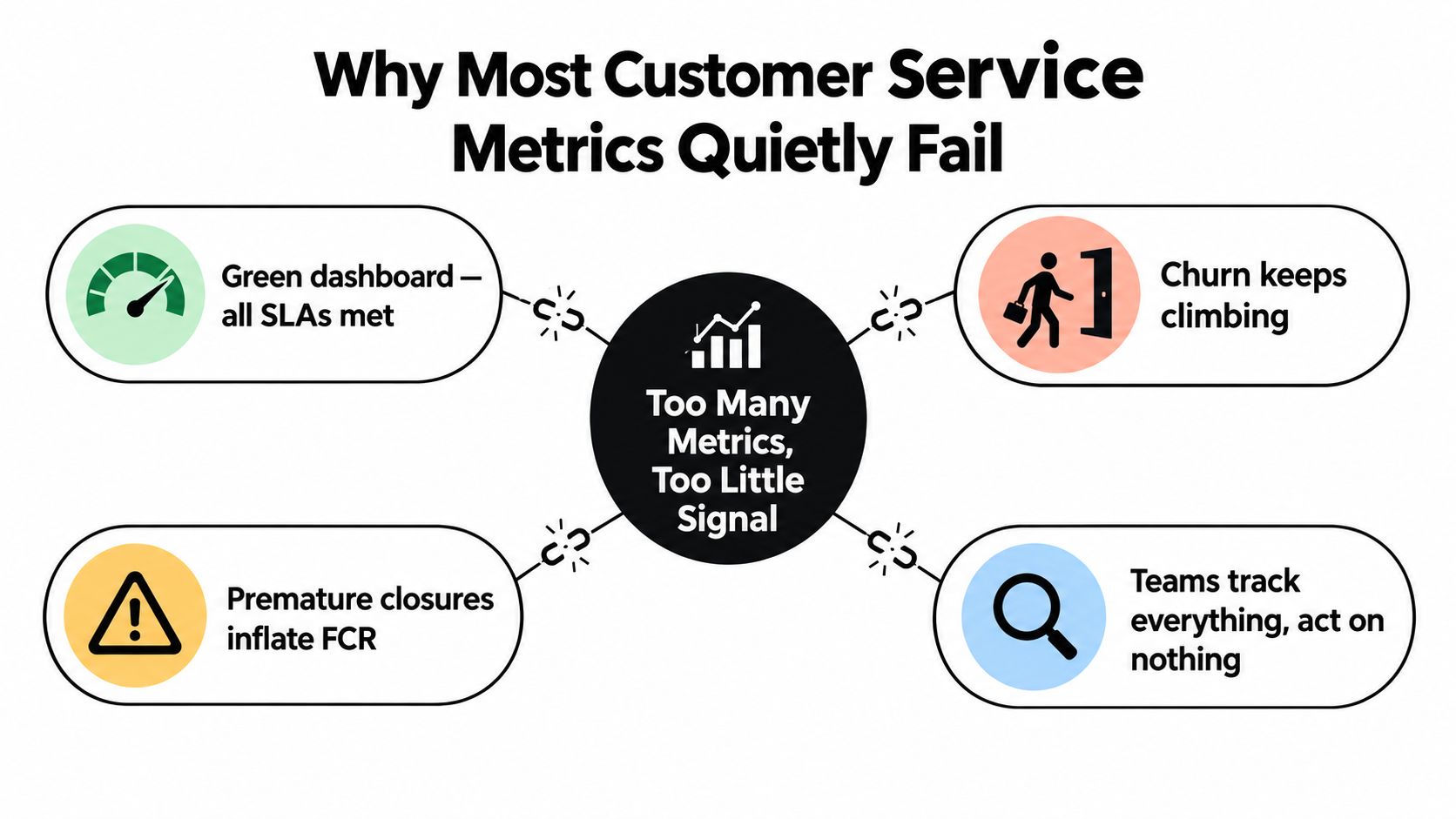
Your support dashboard is green. First-response targets are met, queues look controlled, and the team is closing tickets at a respectable pace. Then churn climbs, customers return with the same problem, and agents learn that "resolved" often means "please stop counting this ticket."
That's the failure mode of customer service metrics. Teams collect plenty of numbers, but they don't always measure whether customers received an accurate, durable resolution. The fix isn't another dashboard. It's a sharper scorecard that separates speed from outcome quality, pairs every headline metric with a counter-metric, and gives someone a clear decision to make.
[blocked]
A support manager I worked with once celebrated a perfect service-level week. The team had answered quickly, cleared the queue, and met its internal targets. A review of customer conversations told a different story. Agents rushed complex cases, closed tickets after sending generic instructions, and left customers to reopen the conversation when the fix didn't work.
The dashboard wasn't technically wrong. It was answering a smaller question than leadership thought it was answering.
Customer service metrics are a translation layer between customer experience and business health. First-response time tells you how quickly someone reached the queue. It doesn't tell you whether the reply helped. Ticket volume tells you how much demand arrived. It doesn't tell you whether a product defect created that demand. A closure count tells you what the team marked complete. It doesn't prove the customer's problem disappeared.
[blocked]
Practical rule: Every metric needs an owner, a definition, a segment, a review rhythm, and a decision attached to it.
The standard should be durable resolution. A customer receives a relevant answer, can complete the intended task, doesn't need to restart the conversation, and doesn't escalate because the first response created more work. That standard is harder than “ticket closed,” which is exactly why it's useful.
Teams also need a sensible workspace for the evidence behind the numbers. A platform such as Zemith's research and productivity workspace can help keep transcripts, notes, documents, and action plans together, but the tool won't rescue a bad definition. Start by deciding what good service means, then measure it.
[blocked]
Before choosing a KPI, define what the number is measuring. Most reporting arguments are definition arguments wearing business-casual clothing.
Every customer service metric has four building blocks:
A thermometer measures temperature. A speedometer measures velocity. A dipstick measures depth. Customer service metrics work the same way: each instrument is useful only when you know what it measures and where it stops being useful.
[blocked]
Leading indicators show what the operation is doing now. First-response time, average handle time, queue age, deflection, and backlog can reveal pressure before customers leave. They're useful levers, but they're easy to game.
Lagging indicators show what customers experienced or decided later. CSAT, NPS, retention, churn, repeat contact, and escalation outcomes reveal whether the operation produced a valuable result. They're harder to manipulate, but they arrive after the damage.
Use both. A fast team with worsening satisfaction needs investigation. A satisfied team with an exploding backlog needs capacity planning. You can explore those relationships more systematically with Zemith's tools for data analysts, especially when survey exports and operational data live in different places.
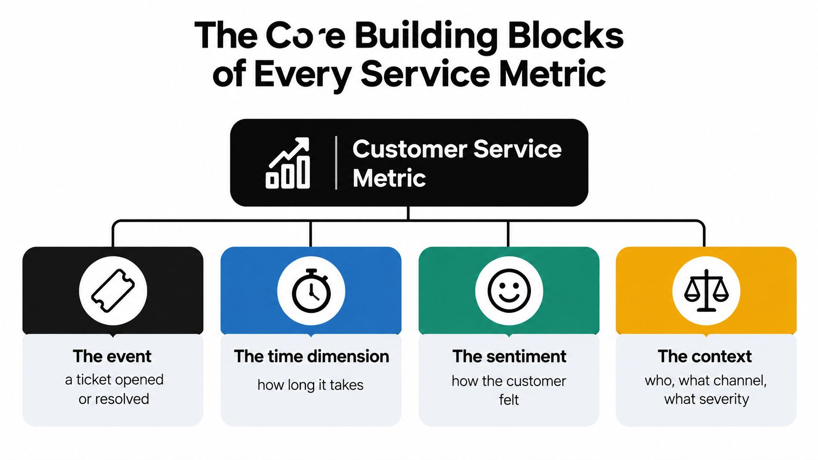
Context completes the definition. Segment by channel, issue type, severity, customer segment, language, business hours, and whether automation handled the interaction. A blended average can make a simple password question look identical to a technical incident. It isn't.
[blocked]
A support team celebrates faster closures while customers reopen the same tickets. The dashboard reports improvement, but retention weakens. That failure starts when leaders treat speed as proof of service quality.
Speed metrics answer, “How quickly is the service engine moving?” Outcome metrics answer, “Did the customer get what they needed?”
First-response time, average handle time, average speed of answer, and resolution time measure movement through the queue. First-contact resolution, CSAT, NPS, customer effort, repeat-contact rate, and churn measure what followed. Use the groups together, because either one alone can produce a misleading verdict.
A team can reduce average handle time by shortening conversations, transferring difficult cases, or closing tickets before the customer confirms the fix. The result looks efficient until that customer returns, often angrier and through a more expensive channel. Set a quality guardrail beside every speed target.
Outcome metrics cannot excuse an overloaded queue. A team may spend generous time on each conversation while urgent cases wait. Track response and capacity signals alongside resolution quality, then investigate trade-offs instead of celebrating a single improving line.
Use this test: a metric is primarily about speed if it improves when agents close faster, even when customers are no happier. It is an outcome metric if improvement requires a genuine resolution.
A 2025 benchmark report covering 32,000 companies, 1.2 billion tickets, and 138 million conversations (Customer Service Benchmark Report 2025) reported resolution time falling from nearly 32 hours to 32 minutes. Faster closure still did not prove that the customer's problem was solved. Pair resolution time with reopened tickets, repeat contacts, escalations, and customer feedback.
AI makes this distinction harder to ignore. An automated reply can improve first-response time instantly while delivering an inaccurate answer just as quickly. Measure automation speed, then judge it by the customer's next action. A solved issue, not a fast message, earns the metric's credibility.
[blocked]
A useful scorecard doesn't contain every metric your help desk can export. It contains the measures that help the team make better decisions.
[blocked]
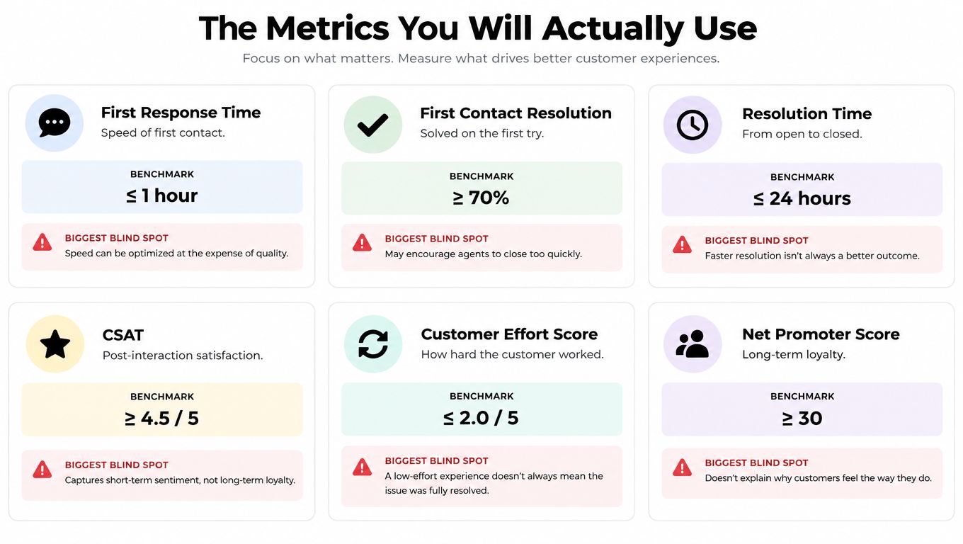
CSAT is usually collected after an interaction, often through a rating scale from 1 to 5. It's a transactional signal. Use it to compare issue types, channels, agents, and resolution paths, but always attach an open-text reason when possible. A high score after a simple request shouldn't be compared casually with a low score after a billing dispute.
NPS measures relationship-level loyalty, not just the last support interaction. Customers answer how likely they are to recommend the company or service on a 0 to 10 scale. Promoters score 9 to 10, passives score 7 to 8, and detractors score 0 to 6. The calculation is:
NPS = percentage of promoters minus percentage of detractors
Passives remain in the response total but don't enter the subtraction. For example, 50% promoters and 20% detractors produces an NPS of +30, as explained in Bain's NPS calculation guide.
Don't publish only the headline score. Preserve promoter, passive, and detractor shares, response count, segment, and reason categories. A large passive group can signal quiet indifference even when the headline looks respectable.
Customer Effort Score, or CES, asks how easy it was to resolve the issue or complete the task. Use it after workflows where friction matters, such as account access, document handling, billing, or technical setup. Pair CES with the exact step that caused effort. “Hard” isn't an action plan.
[blocked]
First-contact resolution, or FCR, measures the percentage of eligible issues resolved during the first interaction without a follow-up, escalation, or reopened ticket. Calculate it as:
FCR = resolved cases on first contact ÷ total eligible cases × 100
The definition must state how transfers, reopened cases, bot-only conversations, and exceptional categories are handled. The FCR and service-answer guidance recommends pairing FCR with satisfaction, resolution time, escalation rate, and repeat-contact rate. That combination prevents a team from celebrating closures that customers immediately undo.
First-response time, or FRT, measures elapsed time between a customer request and the first human or automated reply. The benchmark source reports an average email response time of 12 hours and 10 minutes across a study of 1,000 companies, while only 36% responded within four hours. The FRT benchmark reference also distinguishes channels. Live chat is measured in seconds or minutes, while email and social support are generally measured in hours.
Track FRT by issue type and channel. Report the median, 90th percentile, SLA attainment, and business-hours versus after-hours performance. A fast acknowledgement that says “we got your message” isn't equivalent to a relevant first reply.
Average handle time, or AHT, measures how much agent time a contact consumes. It's useful for staffing and workflow analysis, but dangerous as a standalone target. Pair it with FCR, CSAT, and repeat contact. If AHT drops while those outcomes worsen, the team isn't becoming efficient. It's exporting work to the customer.
[blocked]
SLA compliance measures how often cases meet a defined response or service threshold. Treat it as an access promise, not a quality certificate. A team can answer within the threshold and still provide an incomplete answer.
Ticket volume shows demand. Segment it by active customer base, issue category, product area, and channel where the data allows. Rising volume may reflect growth, a broken release, confusing documentation, or successful adoption of a new contact path.
Resolution rate shows how many cases the team marks resolved within a period. It's a capacity measure, not proof of durable resolution. Pair it with reopened tickets and repeat contact.
Churn shows lost customers over a defined period. It's an important lagging signal, but it doesn't explain cause. Connect cancellations to recent support history, unresolved issues, response delays, and detractor feedback rather than blaming the last agent who touched the account.
Open-text sentiment gives the “why” that a score can't provide. Code recurring themes such as confusing instructions, product defects, billing friction, missing documentation, and trust concerns. The goal isn't to turn every human sentence into a perfect label. It's to identify patterns the dashboard can't see.
A small team can consolidate survey exports, support transcripts, research notes, and follow-up actions in a single project workspace. That makes the qualitative evidence easier to review beside the metric that triggered the investigation.
The pairing matters more than the individual score. Read NPS with retention data, FCR with repeat contact, AHT with CSAT, and resolution rate with reopen rate. A dashboard that only shows the first number in each pair is a scoreboard, not an operating system.
[blocked]
Small software teams often don't need a giant service suite. They need one place where a customer can chat, search documentation, report a bug, see a roadmap, check service status, and book time with a human without forcing the team to stitch together five separate tools.
Convot is a help desk for small software teams, built by a solo founder. It combines live chat, a shared inbox, help center, changelog, roadmap, status page, scheduling, and a grounded AI agent. Shopify app developers are a particularly strong fit, especially when one team supports several products from one inbox.
Cove AI answers from the team's own documentation, cites its sources, and hands off when it isn't confident. That design matters for customer service metrics because AI should be evaluated on answer accuracy, handoff quality, repeat contact, and durable resolution, not only on conversations it prevented from reaching an agent.
The product also includes two-way auto-translation in 60+ languages, a help center on the team's own domain in 12 languages, shared inbox views, private notes, mentions, a branded status page, call booking with Google Meet links, agent apps for iOS and Android, and developer tools such as REST API, signed webhooks, HMAC identity verification, and an MCP server.
For Shopify apps, conversations can show the merchant's plan, MRR, and billing history from the Shopify Partner API. Crisp imports are available in one click, while moves from Intercom, Zendesk, and Freshdesk include a free migration done with the founder. Pricing includes a free Community plan while under $1,000 MRR, then paid plans from $49 per month through $299 per month, with add-ons, and Cove AI at $0.20 per resolved conversation, about a fifth of Intercom Fin's $0.99. The Convot help desk for SaaS teams also publishes a customer service statistics roundup with 104 sourced figures to benchmark these metrics against.
Convot is a sensible choice when you're tired of per-seat sprawl, support several apps, or need customer context beside the conversation. It isn't a forecasting system. It shows revenue and past churn, but it doesn't predict churn or produce churn-risk scores. Evaluate it as an operating hub for measurable service workflows, not as a magic retention machine.
[blocked]
The most dangerous dashboard is the one that improves while the customer experience deteriorates.
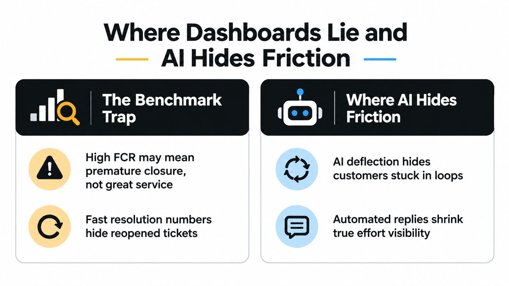
A high FCR score can mean excellent routing, strong documentation, and capable agents. It can also mean agents close tickets before the customer confirms the fix. Fast resolution can reflect a clean workflow. It can also hide reopened tickets and repeat contacts. The number doesn't tell you which story is true.
[blocked]
Call a ticket apparently resolved when the system records closure. Call it durably resolved when the customer's intent is met without a near-term repeat contact, escalation, reopen, refund, or complaint.
Use counter-metrics to expose the difference:
Universal benchmarks are usually lazy management. A high FCR target may be appropriate for a password reset and harmful for a safety concern, billing dispute, accessibility issue, or technically complex incident. Segment by complexity before judging the team.
AI creates a second blind spot. In a 2025 survey of 250 U.S. professionals, 54% used CSAT, while only 23% used digital self-service adoption rate, and 71% viewed generative AI as a key driver of customer-experience improvement. The digital customer experience survey suggests many teams are applying legacy human-agent measures to automated interactions.
[blocked]
A deflection rate rises when customers stop creating tickets. That can mean successful self-service. It can also mean abandonment, looping, or migration to phone and email.
Audit AI-assisted conversations for:
An AI agent workspace is useful only when it preserves that evidence. Don't reward automation for making the queue look smaller. Reward it for resolving the right intent safely.
[blocked]
A useful scorecard starts with the decision your team must improve. Choose a primary outcome, a primary speed signal, and a counterweight that exposes gaming or hidden customer effort. A dashboard with ten unchecked tiles is decoration, not management.
Speed only means something within its channel. Email benchmarks run in hours, while live chat runs in minutes. Normalize each channel against its own baseline before comparing teams, using the email response-time reference for context. A fast reply that fails to resolve the issue is a queue-management win, not a service win.
[blocked]
Collect: Timestamp the request, first meaningful reply, handoff, resolution, reopen, escalation, and customer follow-up. A bot acknowledgement should not count as a meaningful first response. Tag issue type, channel, complexity, and automation involvement.
Segment: Separate billing from technical support, business hours from after-hours, new customers from established ones, and simple requests from complex cases. Without these cuts, averages conceal the work creating delays and repeat contacts.
Report: Put one outcome, one speed metric, and one counterweight on each team view. Remove any tile that does not trigger a decision.
Review: Ask what changed, why it changed, and which action follows. If nobody can name the action, retire the metric. Rebuild the scorecard when the team starts optimizing the number instead of the customer result.
Share service context with sales and account teams. A workspace such as Zemith for sales teams can organize customer research, transcripts, and follow-up material. The operating rule matters more than the platform: service evidence should reach the people shaping the customer relationship.
[blocked]
A dashboard can show faster replies while customers contact support repeatedly. That happens when the workflow captures convenient timestamps but misses the events that explain whether the issue was actually solved. Instrument the case history first, then build the dashboard around decisions.
[blocked]
Timestamp each meaningful step: request arrival, first relevant response, ownership change, customer reply, resolution, reopen, escalation, and follow-up. A bot acknowledgement should not count as a meaningful first response.
Tag every case by issue type, channel, severity, customer segment, and resolution path. Keep bot-only interactions separate from human-assisted cases. If automation answers a question and the customer later contacts an agent about the same problem, link those interactions to the original case. Otherwise, the dashboard can count one unresolved issue as two successful contacts.
Because the FCR formula is already defined above, focus here on the event trail behind it. First-contact resolution is trustworthy only when reopen and transfer events are timestamped and linked to the original case. Record exclusions visibly, especially cases that require investigation or another team. Hidden exclusions turn a useful measure into a target-management exercise.
[blocked]
Executive view: Show durable resolution, CSAT or NPS movement, repeat contact, escalation, churn context, and major issue themes. Keep the view tied to business risk and decisions.
Team-coach view: Show FRT distribution, FCR, AHT, reopen rate, SLA performance, and coded feedback by issue type. Managers should use these measures to improve workflows, not punish agents for averages shaped by case mix.
Real-time queue view: Show unassigned cases, queue age, urgent issues, ownership, and breached or approaching thresholds. Use it for today's staffing and routing decisions, not long-range strategy.
Keep the dashboard small. A tile without an owner, threshold, or planned action is decoration.
Use a document or AI workspace to consolidate transcripts, survey exports, research notes, and action plans. Zemith's approach to analyzing data with AI offers a practical model for reviewing evidence scattered across files and conversations.
[blocked]
Review the system on a 90-day operating cycle. Audit definitions, test event capture, release a small dashboard, and check whether each metric changed an action. Keep retention and revenue as context, then investigate the customer evidence before assigning support a commercial result.
[blocked]
A metrics overhaul doesn't need a data science department. It needs disciplined definitions, a short scorecard, and the willingness to delete numbers that make the team feel productive without improving service.
[blocked]
Audit every existing dashboard and write down the definition behind each metric. Identify duplicate measures, missing timestamps, bot interactions counted as resolutions, and targets that reward premature closure.
Then choose the counter-metric stack. For every speed metric, select an outcome check. For every satisfaction metric, select a qualitative reason. Assign one owner per metric and write the decision that owner should make when the number moves.
[blocked]
Instrument the missing events. Segment tickets by channel, issue type, complexity, severity, customer segment, and automation path. Start with a version-one dashboard containing only the measures the team can trust.
Review distributions, not just averages. FRT should include median and 90th-percentile performance. Resolution time should be separated by issue complexity. FCR should exclude cases that require investigation by design, but the exclusions must be visible rather than conveniently invisible.
[blocked]
Run weekly operational reviews and a regular leadership review. Retire vanity metrics. Tie the remaining KPIs to decisions such as staffing, routing, documentation updates, product fixes, escalation policy, or automation changes.
Use these optimization habits:
Bain reports that lifetime-value differences between NPS detractors and promoters often range from 3x to 8x, while warning that the relationship varies by business, competition, and geography. The Bain discussion of NPS and commercial value supports using NPS as a prioritization signal, not as a guaranteed revenue calculator.
[blocked]
Track a compact portfolio rather than a sprawling catalogue. A small team usually needs an outcome view, a speed view, a counterweight, and a qualitative explanation for each major workflow. If a metric has no owner or decision, it doesn't belong in the active dashboard.
There isn't a universal good score that can be lifted from another company and pasted into yours. Compare CSAT by channel, issue type, customer segment, and trend, then read the written reasons. A stable score with worsening comments is a warning, not a success.
Review queue and SLA signals continuously or daily, team-performance signals weekly, and relationship measures on a longer cadence that gives enough responses to interpret responsibly. Don't force NPS or churn into a daily operational meeting. Don't wait for a quarterly review to notice that today's queue is on fire.
Use support transcripts, repeat-contact patterns, reopened tickets, escalation outcomes, resolution quality audits, complaint themes, and cancellation reasons. Ask reviewers to judge whether the answer was accurate, relevant, complete, and compliant. A survey platform helps collect sentiment, but it isn't the definition of quality.
Customer service metrics aren't the goal. Retention, trust, and durable resolution are the goal. The scorecard is how a support organization listens to customers at scale. Build it around outcomes, use speed as a lever rather than a trophy, and make every number earn its place in the next decision.
If your team's customer evidence is scattered across tickets, documents, surveys, and research notes, bring it into one workspace with Zemith, then build a scorecard that shows not only what moved, but why.


Trusted by teams at


The top models, plus image, video and voice tools, in one plan.
Without Zemith
ChatGPT PlusUS$20.00Claude ProUS$20.00Google AI ProUS$19.99SuperGrokUS$30.00Perplexity ProUS$20.00 MidjourneyUS$10.00
 ElevenLabsUS$6.00Le Chat ProUS$14.99
 RunwayUS$15.00Kling StandardUS$8.80
 Gamma PlusUS$12.00
 Otter ProUS$16.99
 QuillBot PremiumUS$19.95
 Photoroom ProUS$12.99
 Quizlet PlusUS$7.99
Total if paying separatelyUS$234.70/mo
"I love the way multiple tools they integrated in one platform. Going in the right direction."
— simplyzubair
"The quality of data and sheer speed of responses is outstanding. I use this app every day."
— barefootmedicine
"The credit system is fair, models are perfect, and the discord is very responsive. Quite awesome."
— MarianZ
"Just works. Simple to use and great for working with documents. Money well spent."
— yerch82
"The organization of features is better than all the other sites — even better than ChatGPT."
— sumore
"It lives up to the all-in-one claim. All the necessary functions with a well-designed, easy UI."
— AlphaLeaf
"The team clearly puts their heart and soul into this platform. Really solid extra functionality."
— SlothMachine
"Updates made almost daily, feedback is incredibly fast. Just look at the changelogs — consistency."
— reu0691
Hand off the research, writing, design and follow-ups. Zemith picks the tools it needs and brings back finished work.
Search the web, run deep research, read files, create images and run code with GPT, Claude, Gemini, Grok and more.
Zemith keeps working in the cloud and pings you when it's done.
Notion, Linear, Canva, Airtable and more. It asks before it creates or changes anything.
Docs, slides, sheets and PDFs, ready to send.
Chain models and tools on a visual canvas, from one prompt to a finished promo video.
Briefings, reports and reminders run on a schedule and are ready when you need them.
Real-time voice that can see your camera or screen.
The best image and video models, in one studio.
Turn PDFs, links and YouTube videos into podcasts, quizzes, flashcards and mind maps.


 Podcast
 Quiz
Quiz Flashcards
 Mind map
 Infographic