Create a Family Guy Character: The 2026 AI Guide
Want to create a Family Guy character of yourself or a friend? This guide shows you how with AI prompts, style tips, and the all-in-one power of Zemith.com.
You’ve probably got one right now. A cursed little idea that would absolutely fit in Quahog.
Maybe it’s your coworker as a depressed substitute bartender at The Drunken Clam. Maybe it’s your uncle as a town council guy with one suit, one opinion, and way too much confidence. Maybe it’s just you, but with the wrong chin, a louder shirt, and the kind of expression that says “I definitely caused a local problem.”
That’s the fun of trying to create a Family Guy character. The style is instantly recognizable, weirdly simple, and much harder to fake well than people think. Family Guy premiered in 1999 and has aired over 350 episodes, making it one of the longest-running animated sitcoms. Its core characters are so ingrained in pop culture that even side characters like Joe Swanson and the Evil Monkey have recognition rates of 89% and 69% respectively, driving over $1 billion in historical merchandise sales, according to . People know this visual language fast. If your design is off, they feel it immediately.
That’s why random prompting usually gives you “sort of cartoon-ish guy” instead of “yeah, that dude belongs in the same universe as Peter accidentally setting something on fire.”

The good news is you don’t need to be a professional animator anymore. You do need a decent concept, a prompt that understands cartoon anatomy, and a workflow that doesn’t make you juggle six tabs like a caffeinated goblin. If your character idea still feels fuzzy, use a quick before you touch the image generator.
That Freakin' Sweet Idea in Your Head
A common starting point involves the wrong question. They ask, “How do I get AI to draw my friend in Family Guy style?” The better question is, “What makes this person feel like they belong in that world?”
That distinction matters. The show’s humor works because each character has a clean visual read and a clear comic role. Peter looks like chaos. Lois looks perpetually one bad decision away from snapping. Stewie looks like a football-headed international incident. The design tells the joke before the line lands.
Start with the bit, not the face
A strong concept usually has three parts:
- A social role. Brewery manager, failed magician, mall security guard, local weather guy, aggressively cheerful dentist.
- A personality flaw. Petty, smug, completely confused, weirdly intense, too proud for their level of competence.
- A visual hook. Crooked tie, giant glasses, bad combover, coffee stain, clipboard, novelty belt buckle.
If you skip that and go straight to “brown hair guy in cartoon style,” the result will feel generic. AI is fast, but it still needs a joke to draw.
Practical rule: If you can describe the character like a side character intro on the show, you’re ready to prompt.
Build a mini character sheet
Before generating anything, write down:
Age vibe, not exact age
“Tired middle-aged office drone” is more useful than a number.Default expression
Smirk, panic, fake confidence, blank optimism, low-grade resentment.Wardrobe silhouette
Polo and khakis, cheap blazer, mechanic shirt, bathrobe, diner uniform.Prop or accessory
Clipboard, beer mug, pizza box, vape pen, broken phone, stack of forms.
A quick note dump helps. If you want help shaping that rough idea into cleaner traits and prompt language, a chat-based tool like this is handy for turning “funny brewery guy” into something usable.
Nailing the Character Concept Before Prompting
A lot of tutorials jump straight into drawing tricks. That misses the part that makes the design hold together. A major gap in existing tutorials is the lack of guidance on Family Guy's core design principles and anatomical consistency, such as proportion ratios and why certain features are exaggerated. This knowledge is critical for both manual illustrators and AI users to maintain character integrity across different poses and expressions, as noted in this .
That’s the difference between “cute fan art” and “this could survive three different poses without melting.”
The anatomy rules you should respect
The style looks loose, but it has rules:
Heads are simplified and readable Big shape first, details second. If the head silhouette is muddy, the whole design falls apart.
Hands stay simple The four-fingered hands matter because they keep the style clean and animation-friendly.
Faces use exaggeration selectively Not every feature gets pushed. Usually one or two features carry the joke. Big chin. Round eyes. Weird nose. Heavy upper lip. Pick your weapon.
Colors stay flat Don’t imagine rendered skin, shiny fabric, or cinematic lighting. That’s how you accidentally create “Pixar-adjacent insurance salesman.”
A simple concept filter
When I’m pressure-testing a character idea, I use this checklist:
If you fail three of those, don’t prompt yet. Fix the idea first.
Good concepts beat detailed prompts
Here’s the trade-off nobody mentions enough. A weak concept with a detailed prompt still gives weak results. A strong concept with a moderate prompt often works better because the generator has a clean target.
Don’t write a biography. Write a casting note.
For example, “a bitter small-town brewery manager who thinks he’s a visionary, stained work shirt, receding hairline, forced smile, holding a clipboard” is already stronger than two paragraphs of overexplained backstory.
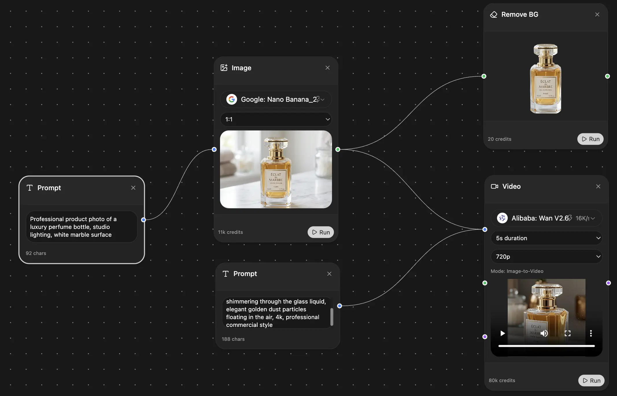
Generating Your Character with AI in Zemith
Now, the fun begins. The core trick is simple. You are not prompting for a person. You are prompting for a very specific 2D TV-cartoon language.
That means your prompt needs style words first, character details second. Successful AI generation of a Family Guy character relies on specific prompt keywords: “bold black outlines,” “exaggerated facial features,” and “flat colors.” With these, user benchmarks show a 70% style match on the first try, rising to 95% after 2-3 prompt refinements. Omitting these style keywords leads to a 60% failure rate as models default to realism, according to .

The base prompt formula that actually works
Use this structure:
[Art style] + [character role] + [facial exaggeration] + [outfit] + [prop] + [expression] + [background simplicity]
A copy-ready example:
Family Guy art style, 2D cartoon, bold black outlines, exaggerated facial features, flat colors, simple shading, four-fingered hands, middle-aged brewery manager with a large chin and receding hairline, stained yellow work shirt, brown pants, holding a clipboard, nervous fake smile, standing in a simple brewery interior, clean composition
That prompt works because every phrase has a job. “Bold black outlines” prevents mushy edges. “Flat colors” blocks the model from drifting into painted rendering. “Simple shading” keeps it TV-cartoon instead of poster art.
If you want a quick primer on image prompting setups, this is useful for understanding how prompt phrasing affects output.
What to change when the image goes wrong
When people get bad results, they usually overcomplicate the prompt or under-specify the style.
Common failure modes:
Too realistic Add “2D cartoon, flat colors, bold black outlines, simple shading.”
Too detailed or noisy Ask for a simple background or no background at all.
Face feels off-model Reduce the number of traits. Pick one strong feature and one secondary feature.
Body proportions get weird Reassert “cartoonish proportions” and keep poses straightforward on the first pass.
The first generation is a scout mission, not the final painting.
Prompt modifiers by model
Different models react differently. Some obey tightly. Others riff. That’s useful if you know what you want.
If you’re comparing image stacks for your wider creative workflow, this roundup of is worth a look because it frames where image generation fits among editing, scripting, and publishing tools.
My favorite way to iterate
Don’t rewrite the whole prompt every time. Change about 10-20% of it. That’s enough to redirect the model without losing the useful parts. Swap the expression. Change the prop. Simplify the environment. Add “thick outlines” if the linework gets soft.
A good iteration sequence looks like this:
Pass one
Nail style and silhouette.Pass two
Improve expression and facial exaggeration.Pass three
Add the prop, costume details, or setting.Pass four
Generate variants with slight personality shifts.Pass five
Pick the winner and move into cleanup.
Often, a lot of people accidentally sabotage themselves. They see one weird ear or one cursed hand and start over from scratch. Don’t. If the core design is there, keep the image and fix the problem in editing.
Refining and Perfecting Your Creation
Now, the AI stops being a slot machine and starts being a production assistant.
You’ve got an output that’s close. The head shape works. The expression is funny. The shirt says “definitely works in some depressing local business.” But there’s a strange hand, a background object that looks like a haunted toaster, or one eye that seems to have its own legal representation.

Fix the obvious stuff first
Start with the problems that break the illusion:
Hands and fingers
If they’re weird, repair or remove them. Cartoon hands should read instantly.Facial asymmetry
Tiny glitches become huge in simple styles. Clean those before touching anything else.Messy props
If the clipboard turns into abstract geometry, regenerate or replace just that area.Distracting backgrounds
Busy scenes can weaken the linework and flatten your focal point.
A lot of creators still treat AI output like the finished product. It usually isn’t. A critical gap exists in guiding creators on how to integrate AI-generated art into a professional production pipeline. There is a need for clear workflows on post-processing AI images into production-ready assets for animation software like Blender or Adobe Character Animator, a process that can be made more efficient using integrated tools, as discussed in this .
Clean the image like a working artist
Here’s the sequence that tends to work best:
Remove junk Delete accidental objects, nonsense shapes, or bad background clutter.
Replace the background A simple scene often works better than a complex one. Think porch, sidewalk, bar exterior, plain interior wall.
Export a transparent PNG This gives you flexibility for thumbnails, memes, edits, or animation prep.
If you’re dealing with a background that won’t cooperate, this practical covers the logic behind clean cutouts and why edge cleanup matters.
A quick visual walkthrough helps here:
When to leave AI and move into a traditional pipeline
If the image is for a meme, avatar, poster, or gift, cleanup may be enough.
If you want something more durable, export the cleaned image and trace or rebuild it in a vector app. That gives you:
- Scalable line art for print or large-format use
- Separated parts for simple puppet animation
- More consistent revisions when you need alternate poses or expressions
A polished AI image is good. A reusable character asset is better.
That’s the professional move. Use AI for speed. Use cleanup and export discipline for quality.
From Image to Asset Your IP and Usage Rights
The image is done. Now don’t lose it in a folder called final-final-final-3.
Once you create a family guy character, the smart move is to treat it like an asset, not a one-off joke. Save the final image, the best prompt version, alternate expressions, transparent exports, and any notes about what worked. If you ever revisit the character later, future-you will be less annoyed. That alone is worth the effort.

Keep a usable character package
A clean character folder should include:
- Final transparent PNG for overlays, thumbnails, and animation prep
- High-res full scene export if you want a poster or social post
- Prompt notes with the exact phrasing that got the best result
- Variant list like angry, happy, confused, side view, sitting
If you need a better system for naming, storing, and versioning creative files, these are worth applying even for small personal projects.
The awkward legal part
Here’s the practical answer. Your character concept may be original. The recognizable show style is still tied to an existing property. That means personal use is one thing. Commercial use is another.
For profile pictures, birthday cards, memes, parody posts, or fan-art style experiments, you’re usually in safer territory. For merch, logos, ads, or monetized brand use, things get murky fast. If you’re unsure how to think through ownership and reuse questions, this piece on how to is useful as a plain-English starting point.
If it looks close enough that a random viewer would assume official affiliation, slow down and get legal advice.
Where these characters are most useful
Custom cartoon avatars work especially well for personal content. AI photo-to-cartoon tools can achieve 92% likeness retention, and post-processing with filters can boost perceived quality by 30%. Content creators using these custom avatars have seen viral TikToks reach over 1 million views 15% faster, according to this .
That doesn’t mean “make one image and become internet famous by lunch.” It does mean stylized character art has real engagement power when you use it for intros, profile branding, reaction posts, or recurring bits.
Now Go Make Something Freakin' Sweet
A good character starts as a dumb little joke in your notes app. Then it becomes a concept, a prompt, a few cursed early generations, one surprisingly good version, and finally something you’d post.
That’s why this process is so fun. You’re not just making an image. You’re building a repeatable workflow for cartoon character design that goes from idea to usable asset without turning your desktop into a tab graveyard.
The key lessons are simple. Start with the comic role. Keep the anatomy and shape language clean. Use style words that force the generator into 2D cartoon logic. Then edit like a professional, not like someone hoping the sixth finger is “probably fine.”
Your next Quahog-adjacent weirdo is probably already halfway formed in your brain. Give them a job, a flaw, a shirt that says too much about them, and let the generator do its thing.
Giggity-adjacent, but tasteful.
Frequently Asked Questions
Can I turn my character into a simple animation
Yes. The easy version is to export your character as a transparent PNG, then create a few extra expressions like happy, angry, confused, and blankly disappointed. Those can be swapped in a simple editor or used as parts in software like Adobe Character Animator or Blender.
For cleaner results, separate the head, mouth area, arms, and torso if you plan to animate more than a basic talking shot.
My character’s face looks distorted or weird. What did I do wrong
Usually one of three things happened:
Your prompt got too crowded Too many traits can confuse the model.
You mixed conflicting instructions “Simple flat cartoon” and “highly detailed realistic face” will fight each other.
The model just produced a dud That happens.
The best fix is to simplify, regenerate, and only add details back after the face shape works. If just one area is bad, repair that region instead of starting over.
Is it legal to use a character in the Family Guy style for my business logo
That’s a bad idea. For personal fan art, parody, and non-commercial use, people have more breathing room. For commercial branding, logos, and anything that implies affiliation, a highly recognizable style can create legal risk.
If the image is tied to your business identity, build your own visual language instead of borrowing one that people already associate with a major show.
What’s the best first prompt if I’m stuck
Start simple:
Family Guy art style, 2D cartoon, bold black outlines, exaggerated facial features, flat colors, simple shading, four-fingered hands, [your character role], [one strong facial feature], [outfit], [prop], simple background
That’s enough to get a solid first pass without overcooking it.
If you want one workspace for the whole process, from brainstorming the joke to generating the character, cleaning the image, and organizing the final asset, try . It’s a practical setup for creators who’d rather make things than babysit five separate apps.
Explore Zemith Features
Every top AI. One subscription.
ChatGPT, Claude, Gemini, DeepSeek, Grok & 25+ more


Always on, real-time AI.
Voice + screen share · instant answers
What's the best way to learn a new language?
Immersion and spaced repetition work best. Try consuming media in your target language daily.
Voice + screen share · AI answers in real time
Image Generation
Flux, Nano Banana, Ideogram, Recraft + more

Write at the speed of thought.
AI autocomplete, rewrite & expand on command
Any document. Any format.
PDF, URL, or YouTube → chat, quiz, podcast & more
Video Creation
Veo, Kling, Grok Imagine and more

Text to Speech
Natural AI voices, 30+ languages
Code Generation
Write, debug & explain code
Chat with Documents
Upload PDFs, analyze content
Your AI, in your pocket.
Full access on iOS & Android · synced everywhere
Your infinite AI canvas.
Chat, image, video & motion tools — side by side
Save hours of work and research
Transparent, High-Value Pricing
Trusted by teams at
Free
No credit card required
- 100 credits daily
- 3 AI models to try
- Basic AI chat
Plus
- 1,000,000 credits/month
- 25+ AI models — GPT, Claude, Gemini, Grok & more
- Agent Mode with web search, computer tools and more
- Creative Studio: image generation and video generation
- Project Library: chat with document, website and youtube, podcast generation, flashcards, reports and more
- Workflow Studio and FocusOS
Professional
- Everything in Plus, and:
- 2,100,000 credits/month
- Pro-exclusive models (Claude Opus, Grok 4, Sonar Pro)
- Motion Tools & Max Mode
- First access to latest features
- Access to additional offers
What Our Users Say
Great Tool after 2 months usage
"I love the way multiple tools they integrated in one platform. Going in the right direction."
— simplyzubair
Best in Kind!
"The quality of data and sheer speed of responses is outstanding. I use this app every day."
— barefootmedicine
Simply awesome
"The credit system is fair, models are perfect, and the discord is very responsive. Quite awesome."
— MarianZ
Great for Document Analysis
"Just works. Simple to use and great for working with documents. Money well spent."
— yerch82
Great AI site with accessible LLMs
"The organization of features is better than all the other sites — even better than ChatGPT."
— sumore
Excellent Tool
"It lives up to the all-in-one claim. All the necessary functions with a well-designed, easy UI."
— AlphaLeaf
Well-rounded platform with solid LLMs
"The team clearly puts their heart and soul into this platform. Really solid extra functionality."
— SlothMachine
Best AI tool I've ever used
"Updates made almost daily, feedback is incredibly fast. Just look at the changelogs — consistency."
— reu0691